Date: 13 June, 2017Type: UX/UIClient: Bravofly
Design of a white label of the brand Bravofly for the Finnish market. The challenge of this project was to improve an already established design without completely losing the relationship with it: customers had to have a feeling they were browsing a better version of the Bravofly website.
Read on for further details and insights.
Date: 13 June, 2017
Type: UX/UI
Client: Bravofly
Design of a white label of the brand Bravofly for the Finnish market. The challenge of this project was to improve an already established design without completely losing the relationship with it: customers had to have a feeling they were browsing a better version of the Bravofly website.
Read on for further details and insights.
During my experience in lastminute.com group as a UX/UI Designer, I was given the task to design a white-label for Bravofly. Some websites use white labels to enable a successful brand to offer a service without having to invest in creating the technology and infrastructure itself. Many IT and modern marketing companies outsource or use white-label companies and services to provide special services without having to invest in developing their own product.
The task was to replicate Bravofly.com homepage and flight search results page for the Finnish market. The white-label had to look like Bravofly.com, but some of its features could be visually improved. Primary, secondary and accent colors had to remain unchanged for the sake of brand awareness. I had two sections to redesign: the homepage and the search results page.
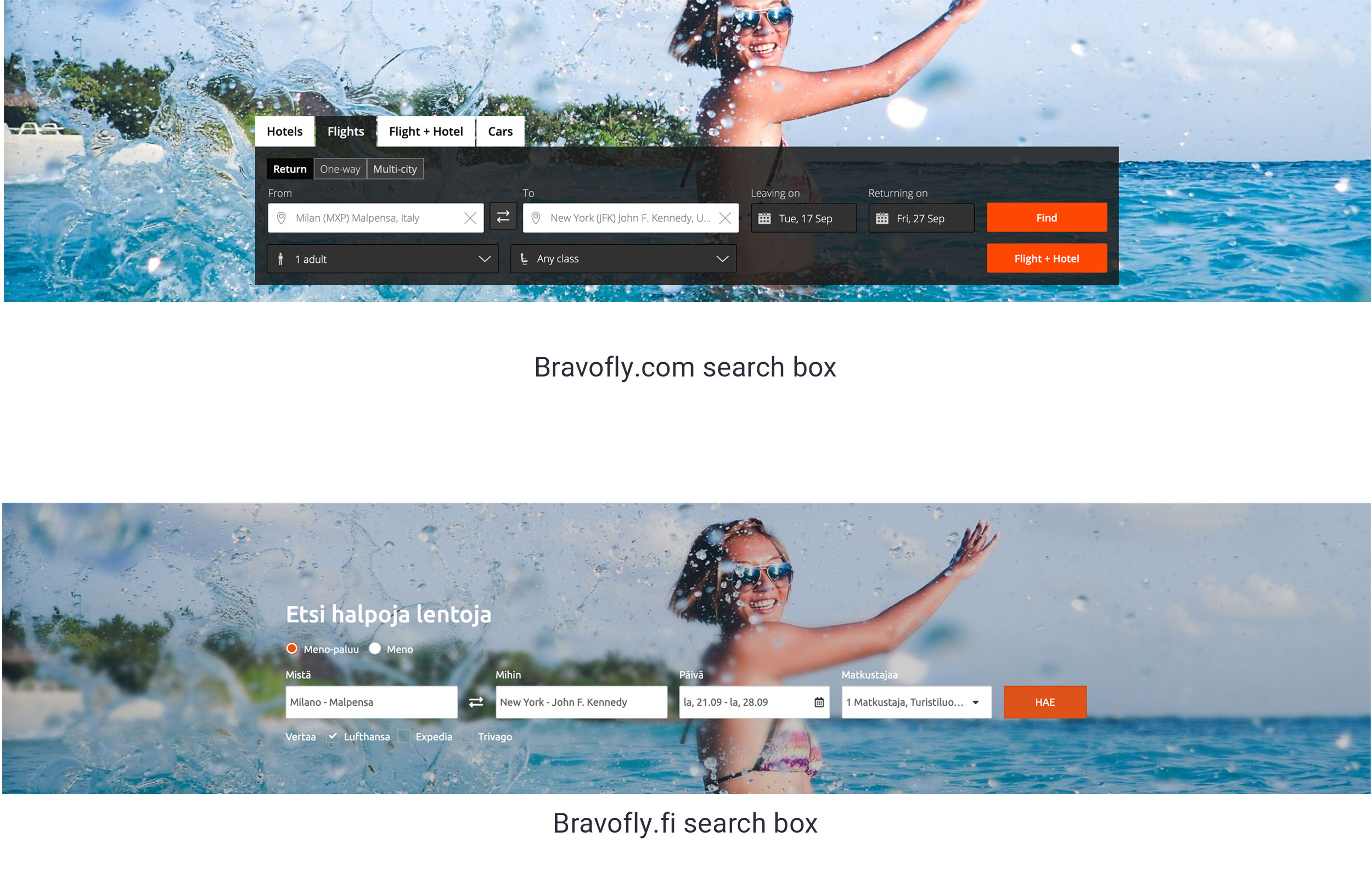
My first impression of Bravofly.com homepage was a sense of heaviness given by the black search box. The dark color and the size of the box obscured the image below and took away the sense of freshness. So the first element I tried to improve was the search box.
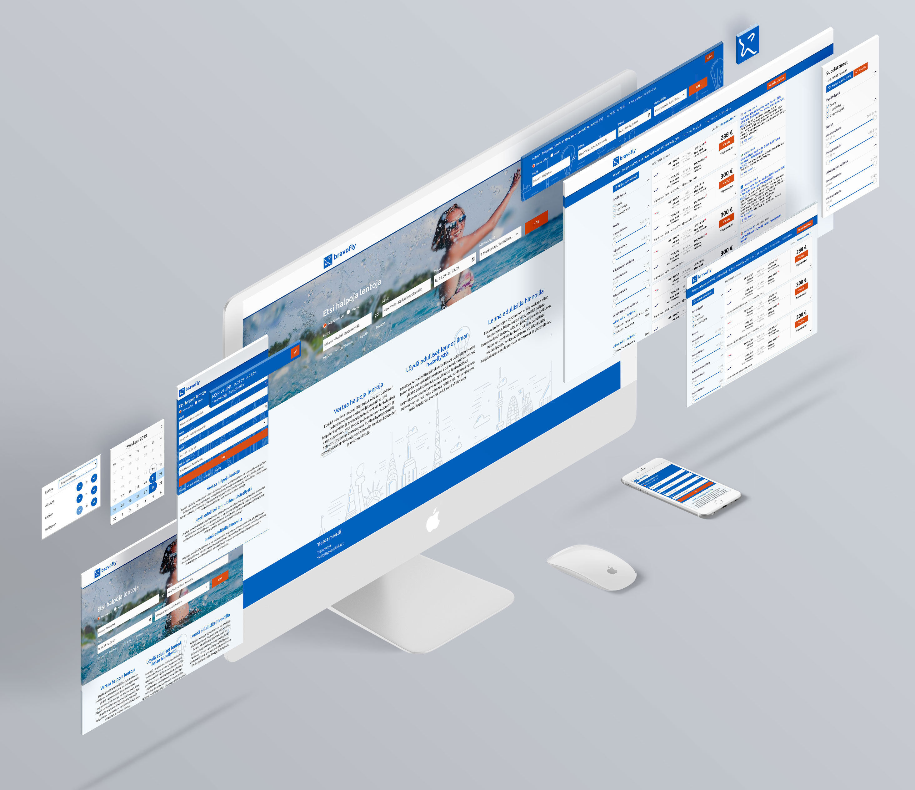
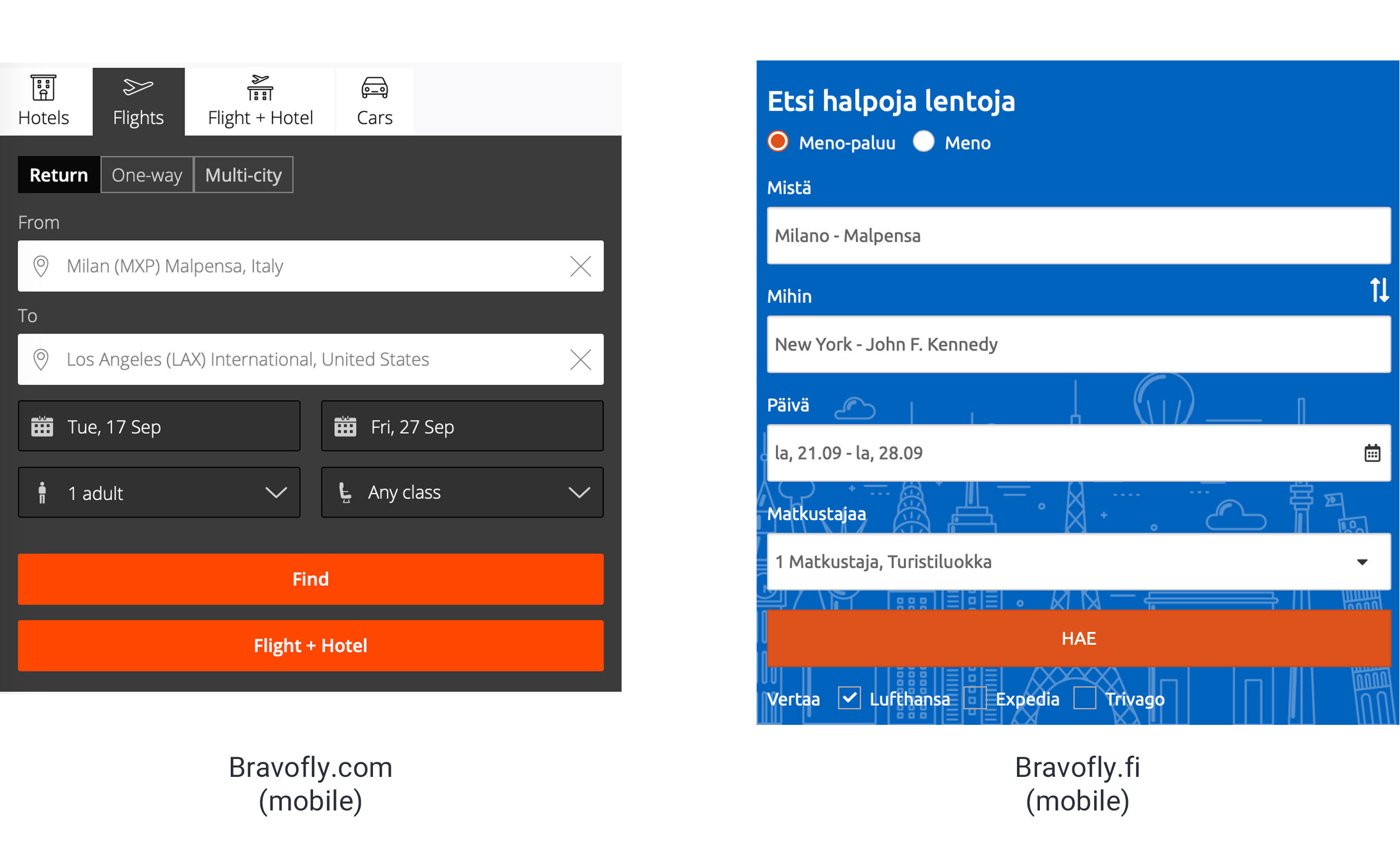
The task was somewhat easy because the Finnish website supported the flight search only. This meant a reduction of the elements included in the box. I removed the heavy black background and gave the input fields inside more air. For legibility purposes, I had to introduce a dark overlay between the search box and the image background, but it could be kept very light. The mobile version of the search box had no image: it was pure black. I decided to change it to corporate blue and added a vector texture in order to make it more interesting.
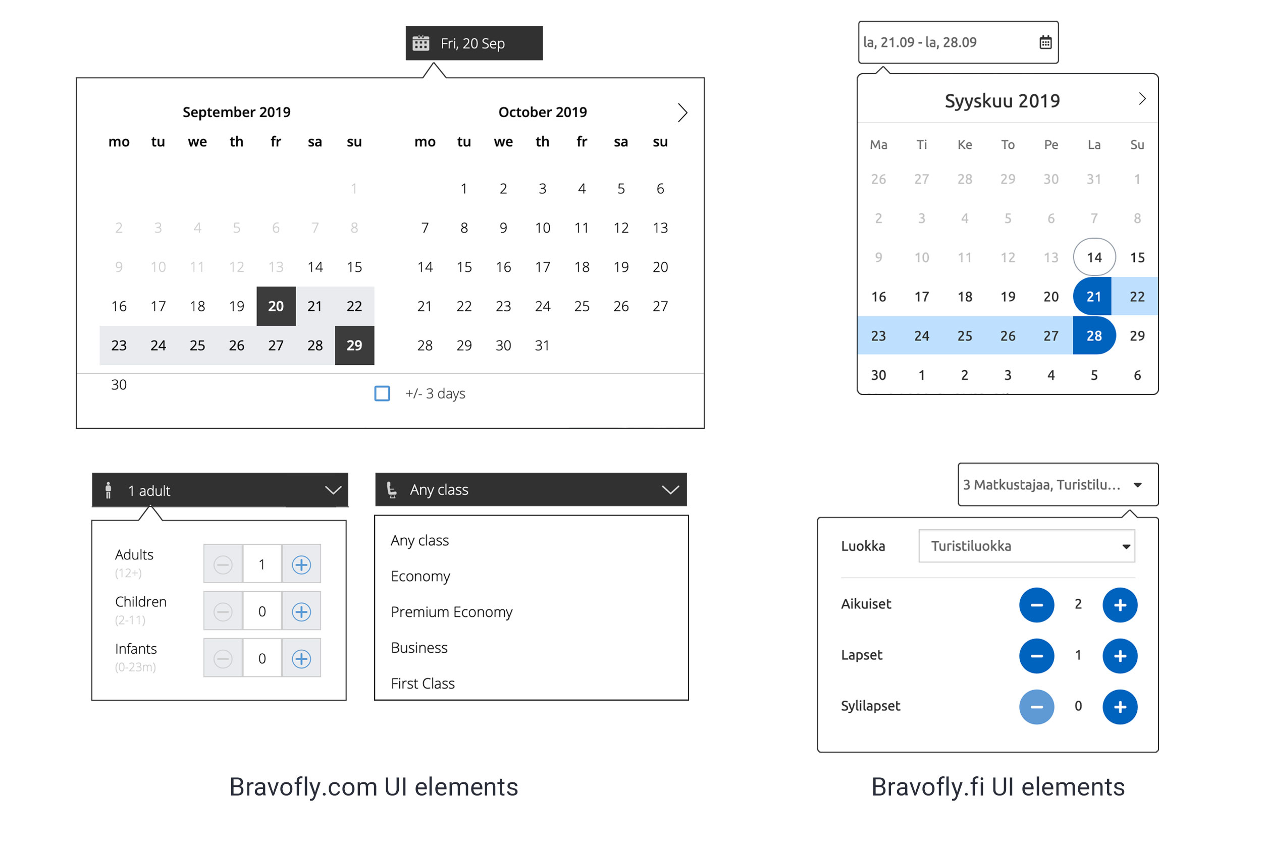
In order to improve usability and gain space, I designed an optimized version of the calendar that grouped two input fields in one. On Bravofly.com the user was presented two input boxes: one for the departure and the other for the return. But the selection of the dates actually happened in the same field, making the second completely useless. I applied the same method to the passengers and class fields and grouped them in one. I rounded the edges and introduces circular shapes to make the design softer.
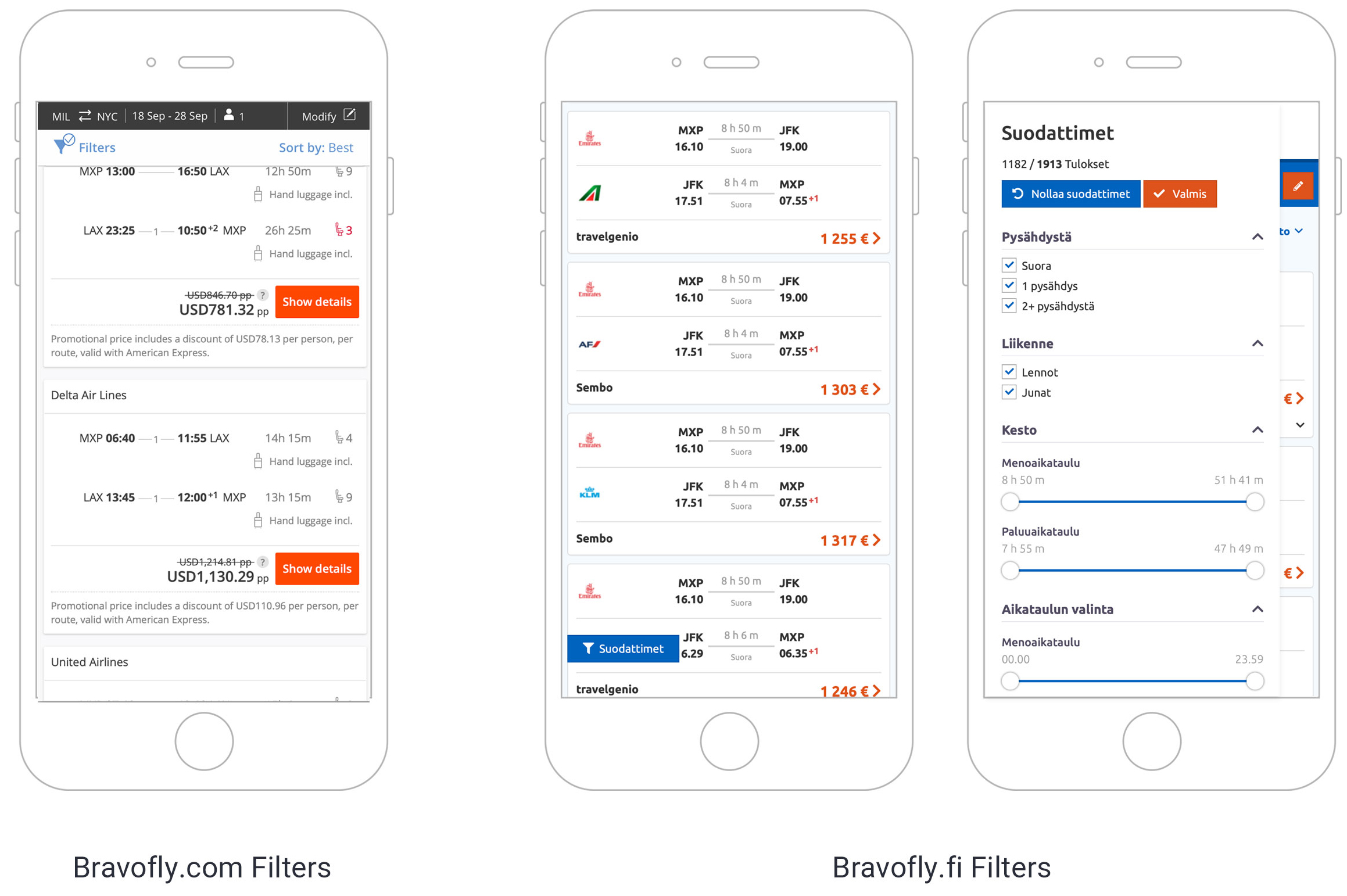
The search results page on the white-label had to support less features than the one on Bravofly.com. Since it was a white-label, the user couldn't book directly on the page but was redirected to another website. Therefore, the UI design was limited to displaying the offers and the filters.
The search box was designed as an accordion in order to gain space on the page. Once collapsed, the user could edit the search criteria and update the results. The background once again was turned from black to corporate blue and the input fields were grouped.
When browsing the site from mobile, I decided not to pin the search box to the top when scrolling. The target of the page was to show as many search results as possible, so the search box actually took away space. Moreover, a second bar with filters and sort by had been pinned under the search box. This resulted in nearly 1/10 of the screen wasted! This is why I decided to unpin the search box from the top of the screen when scrolling and to remove the filters sub-bar. Inspired by Google's Material Design, I introduced a more functional solution for the latter: a FAB at the bottom left corner of the screen. This position didn't bother the layout and was always available to the user if needed.
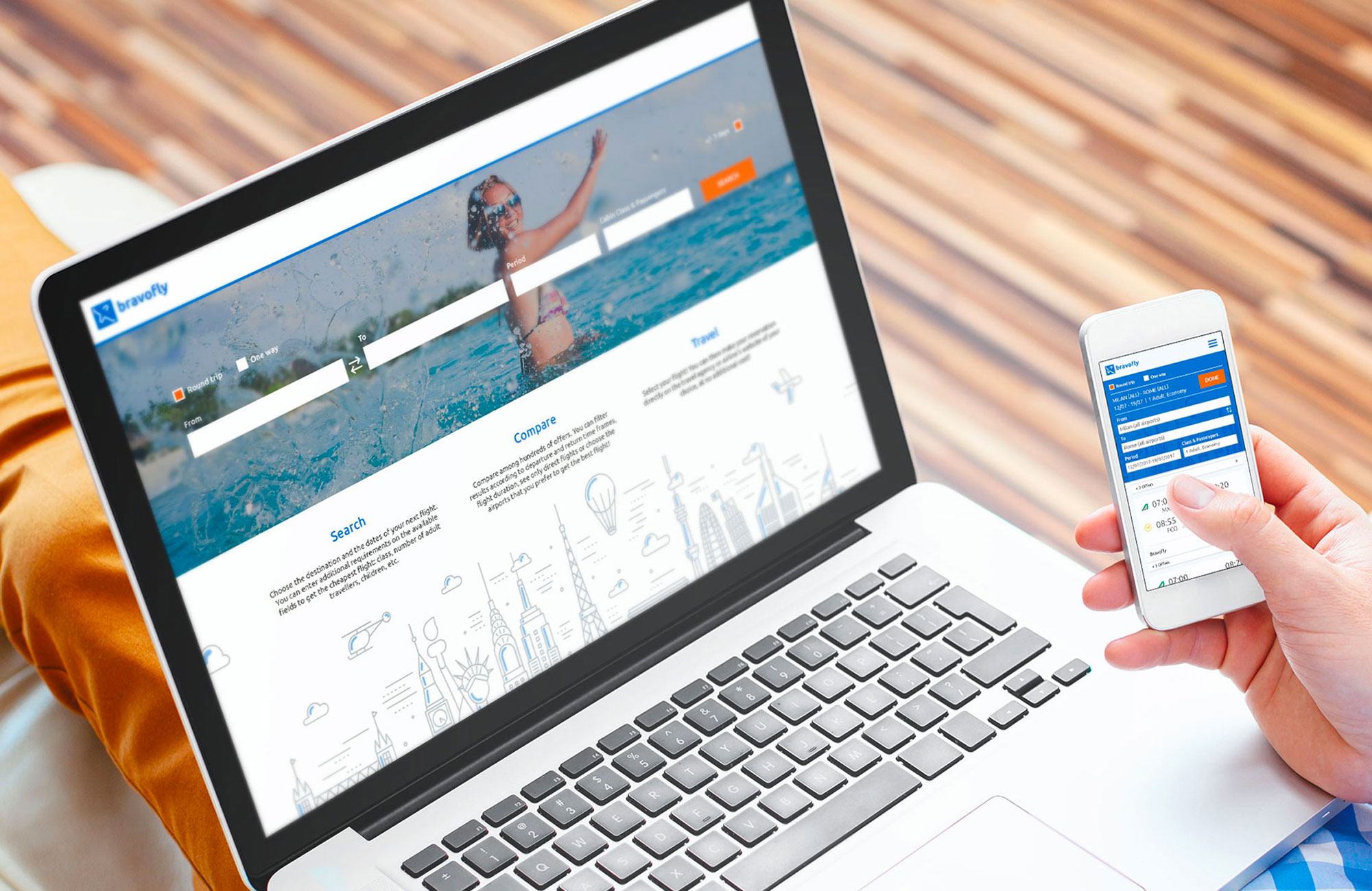
While designing the UI, we tested it on various types of devices. The responsive layout made it adaptable to all screen sizes, portrait and landscape.