Introduction
When I joined Casavo, the website was considered a showcase of the brand. Product teams were focused on their apps for sellers and buyers, while nobody was taking care of the website; nevertheless, the latter was the mandatory entry point for every user.
How could we deliver such a curated experience for our customers while omitting prospects? This is when my team and I realized the company was missing important opportunities and that we could take action.
Understanding Product Goals
The real estate market has always been a dynamic and ever-changing industry, but in recent times, navigating its complexities has become increasingly challenging. Today, aspiring home sellers and home owners are encountering a landscape marked by unique difficulties. Casavo aims to change the way people sell, live and buy homes in Europe, freeing them from complexity.
Mission
Freedom from complexity
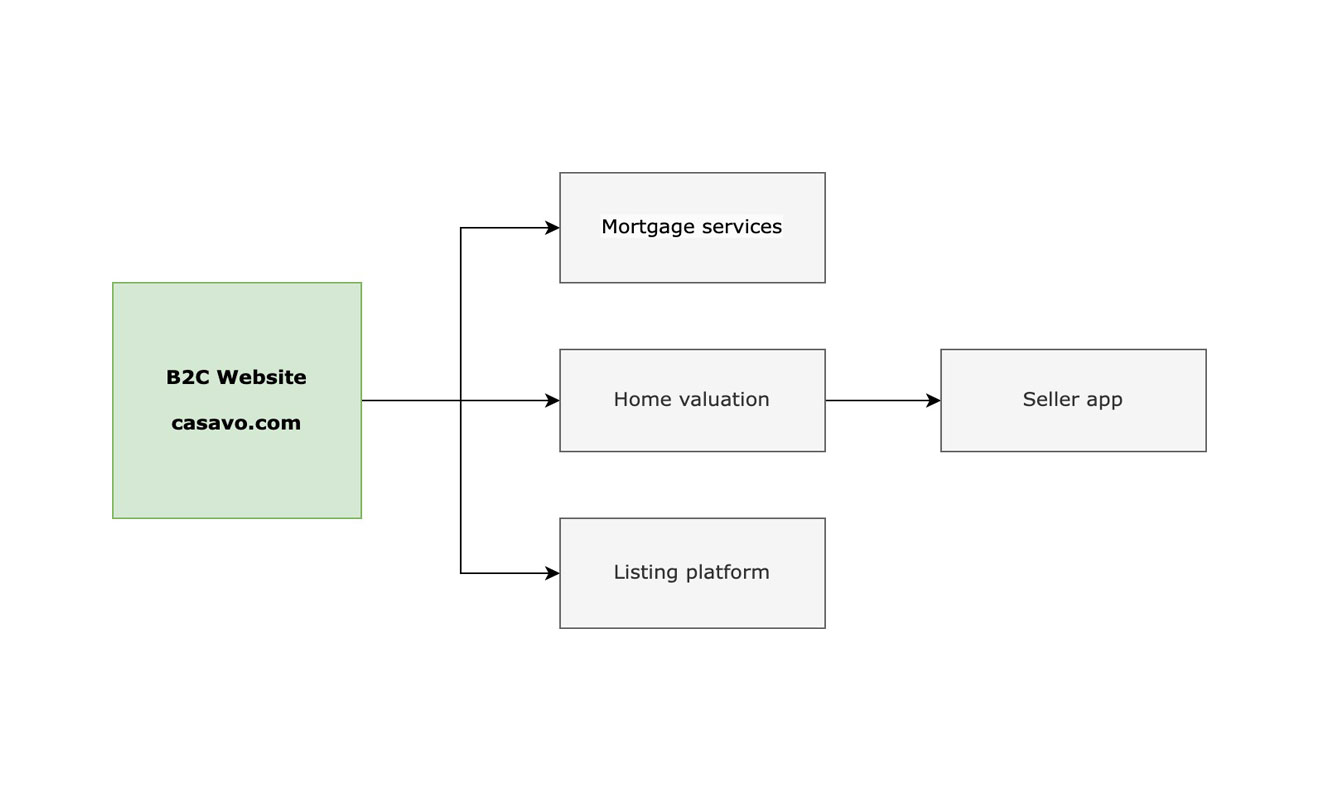
Casavo’s consumer website as of today is the entry point to 3 main experiences:
- Selling a house
- Buying a house
- Obtaining a mortgage
Product goal: encourage users to start using one of Casavo’s services
Interpreting User Behavior
Casavo’s website has a heterogeneous pool of users, ranging from people who are only curious about house-related topics to people who are interested in selling or buying. Journeys therefore can vary depending on the segment.
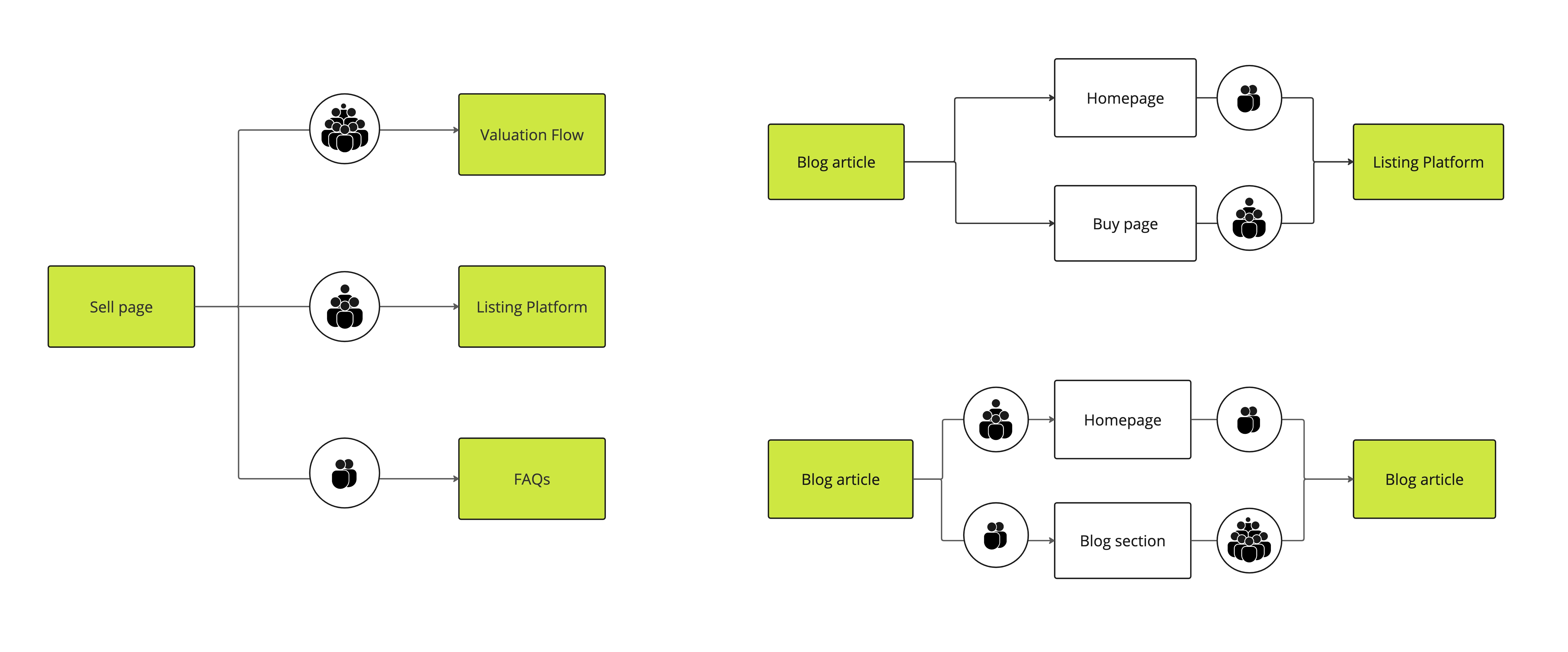
This is where I started: I analyzed journeys from organic and direct traffic to understand how spontaneous users were navigating the website. While some journeys didn’t highlight issues, one in particular caught my attention:
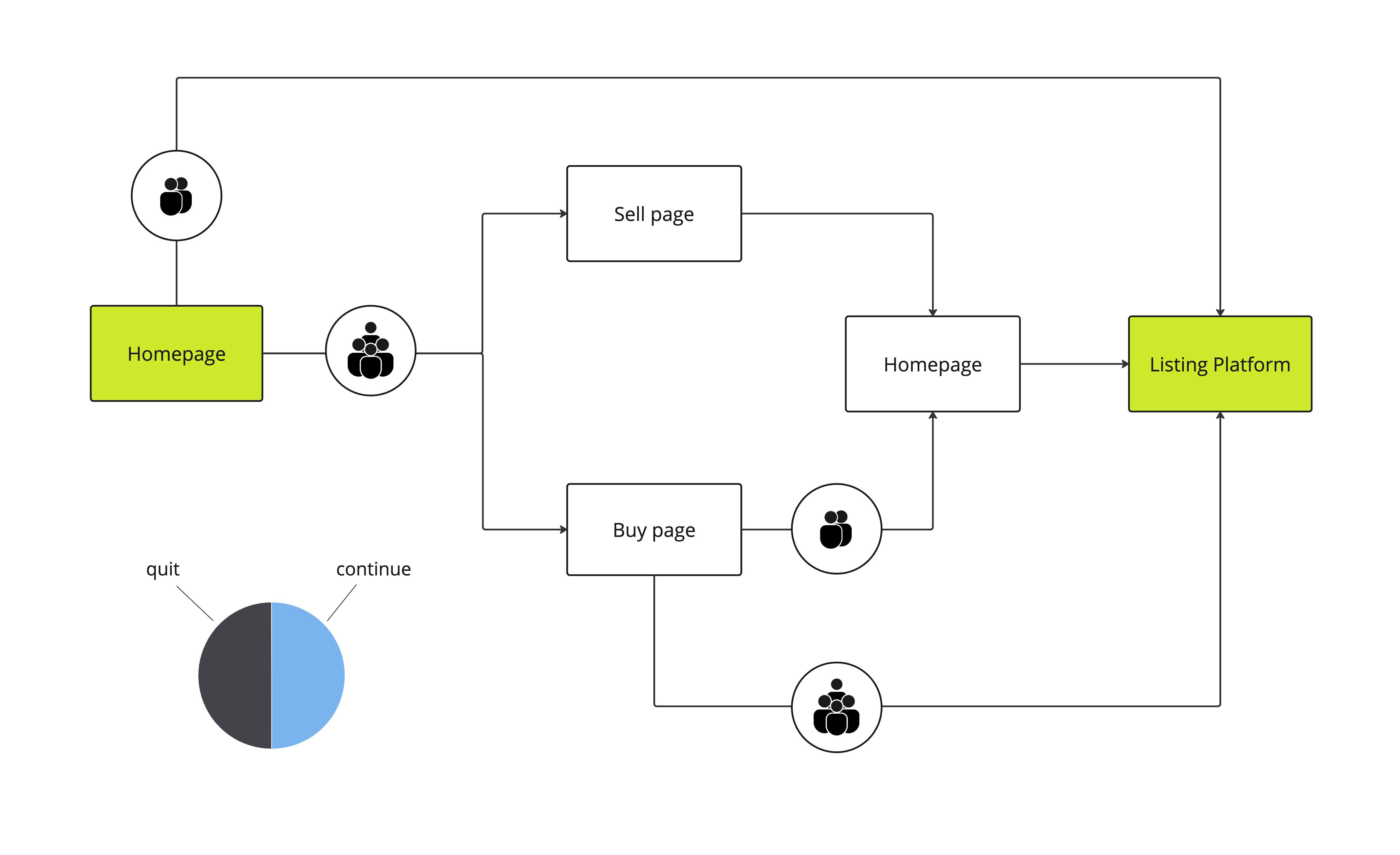
This journey shows that not everyone is understanding how to reach the listing platform from the homepage. There are a few back-and-forth patterns suggesting potential issues with the navigation.
We made some assumptions and identified opportunities just by looking at this flow:
Insight 1: The journey is not linear for all users.
Assumption: Users are going back and forth between pages and don’t understand they can access products directly from the homepage.
Opportunity: Provide direct access to products from the website’s homepage to increase product adoption.
Insight 2: Users are proceeding directly to products
Assumption: Good news! It is however a sign that users are not exploring the website and discovering the brand.
Opportunity: Revise the information architecture and improve interlinking between pages to encourage navigation patterns.
Next, I looked closer at how users were behaving on the pages they landed on during their journey: the homepage, the sell page and the buy page. This is where conversion happened: from here users can start using our products, and this is where we wanted to have the greatest impact.
We generated scroll maps to have a general idea of user engagement:
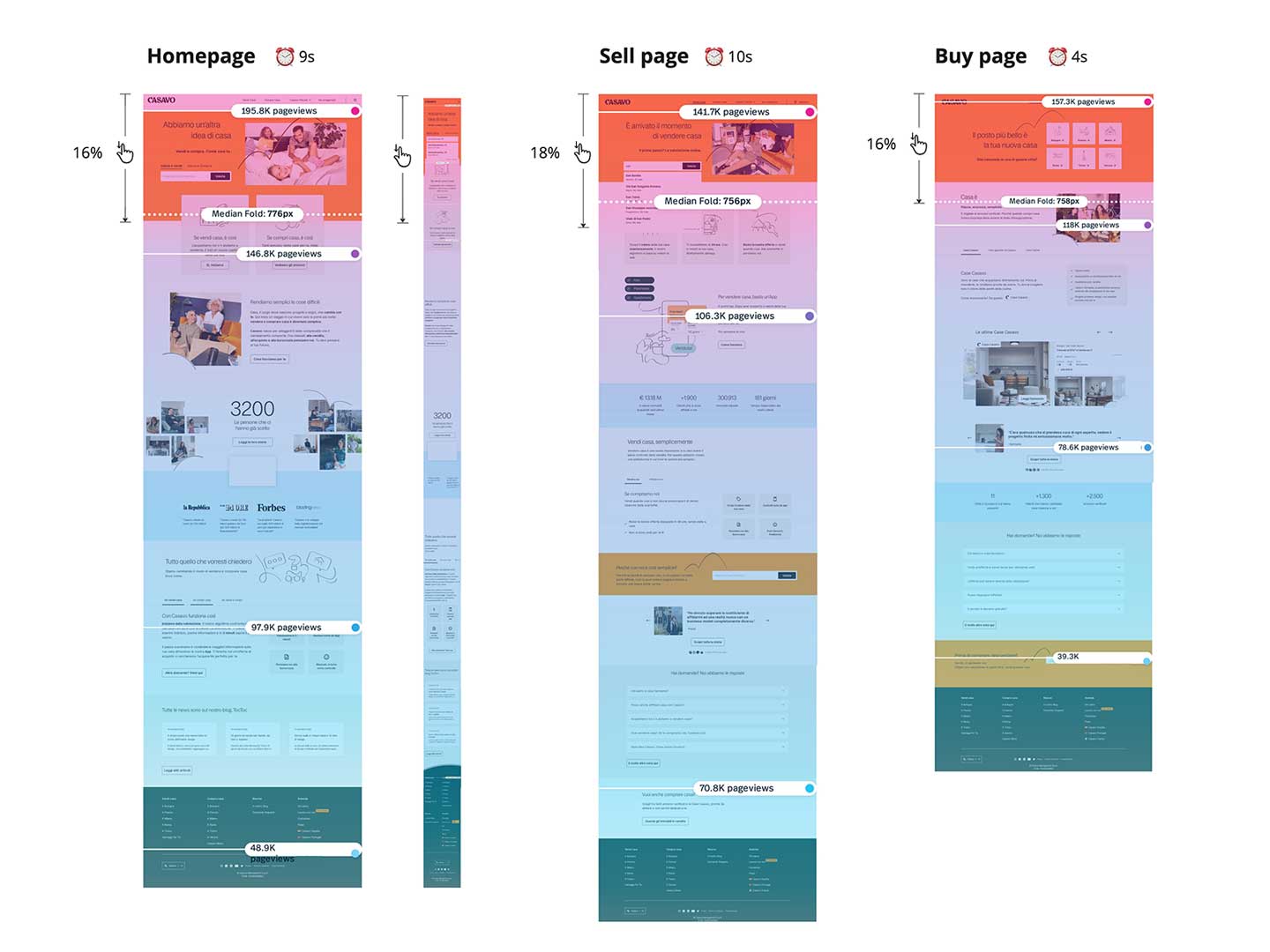
Users visiting our pages are clearly not engaged: scroll-depth is around 17% and average time on page is maximum 10 seconds. Honestly, how much can you assimilate in just 10 seconds? Probably not as much as the business wants to communicate.
I deep-dived user behavior on these pages to confirm my initial assumptions.
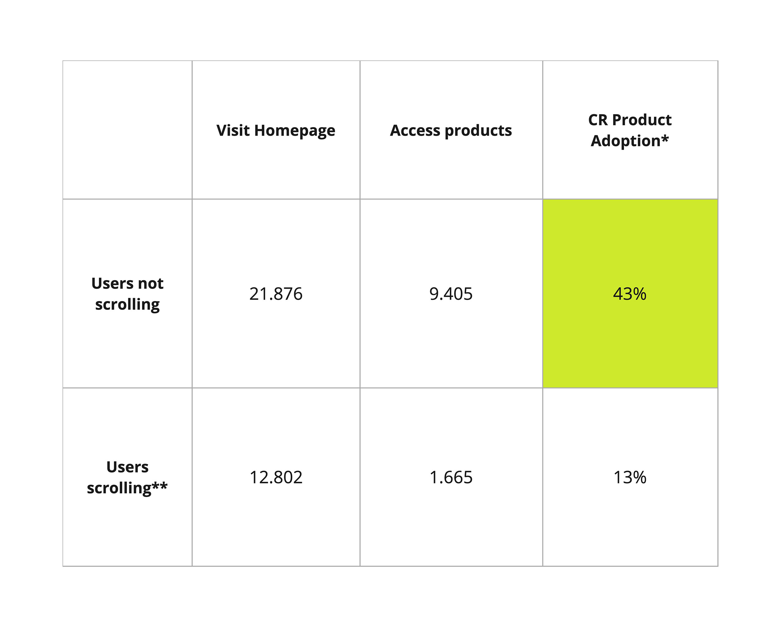
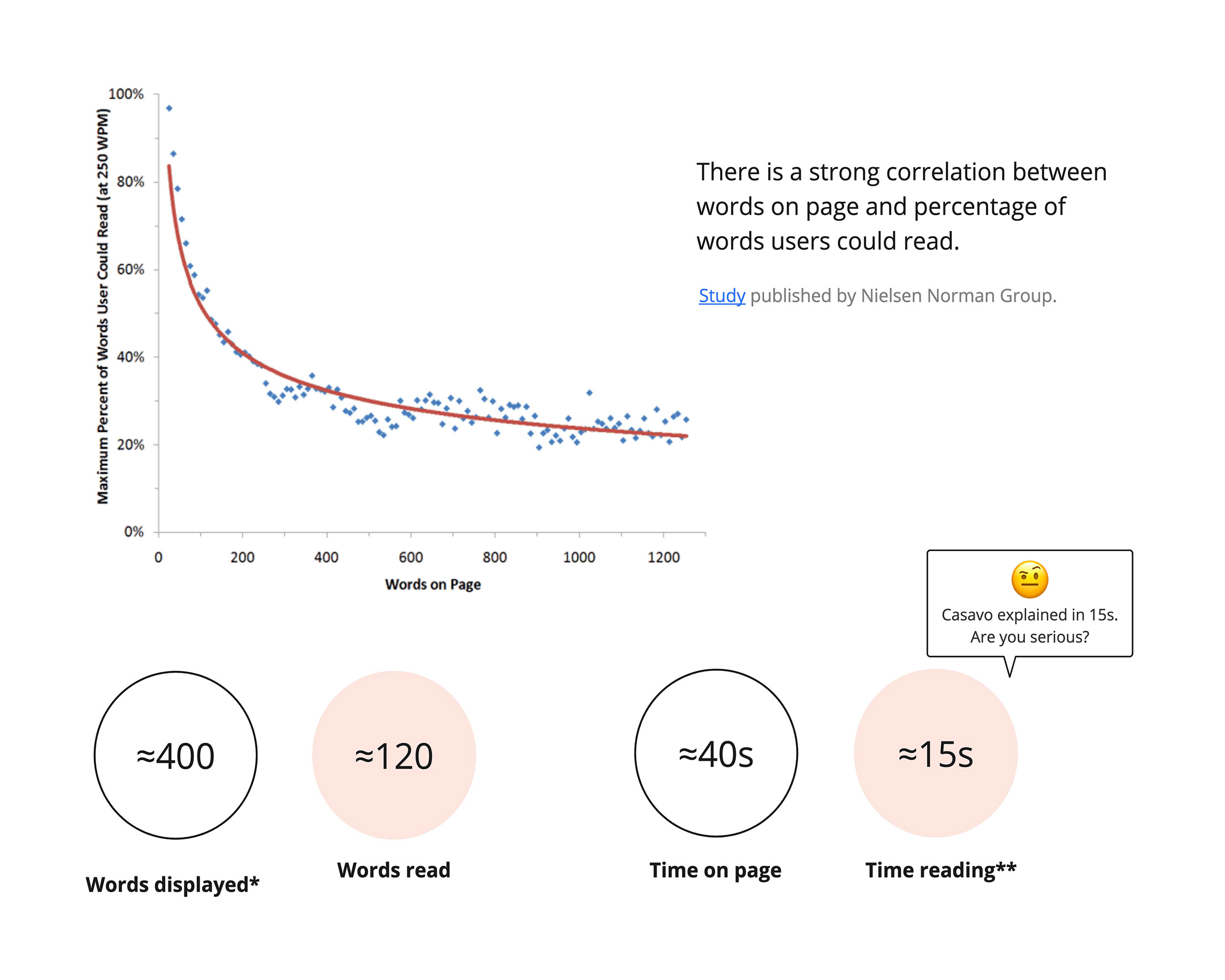
This deeper analysis confirmed my initial assumptions. I was then able to share the following insights with my stakeholders:
Most users converting didn’t scroll down, but turned out to be unqualified leads at the end.
Almost nobody was interested in reading the content or interacting with the page's components.
Desktop and mobile users adopted different navigation patterns.
GOALS AND OPPORTUNITIES
To encourage product adoption, users must engage with the website and understand Casavo's value proposition.
Goal 1:
Efficiently guide users
Opportunity 1:
Introduce meaningful navigation patterns
- Update information architecture according to 2023 strategy
- Enable users to easily find what they are looking for
Opportunity 2:
Improve interlinking between pages
- Identify related sections
- Introduce clear connections
Goal 2:
Efficiently communicate our value proposition
Opportunity 1:
Reduce overall page length
- Condense content on layout
- Adopt progressive disclosure techniques
Opportunity 2:
Make pages more digestible
- Emphasize hierarchy between content.
- Take advantage of scanning patterns.
Opportunity 3:
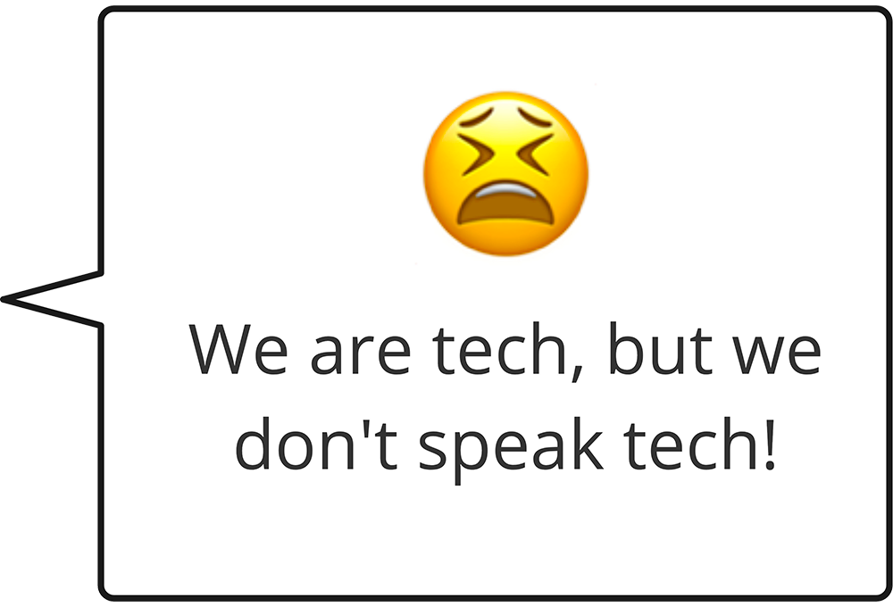
Speak tech!
- Adopt interactions and animations
Redesigning the IA
Definition
Our discovery suggested there were issues with information architecture. Users were not willing to explore the website due to a lack of relevant content and a poor navigation structure.
We approached this opportunity both internally and externally. First, it was important to align the website’s content to the business strategy (as it had become obsolete over time). We conducted a content audit of the content and organized a workshop with internal stakeholders to discuss what to keep, what to remove and what to update.
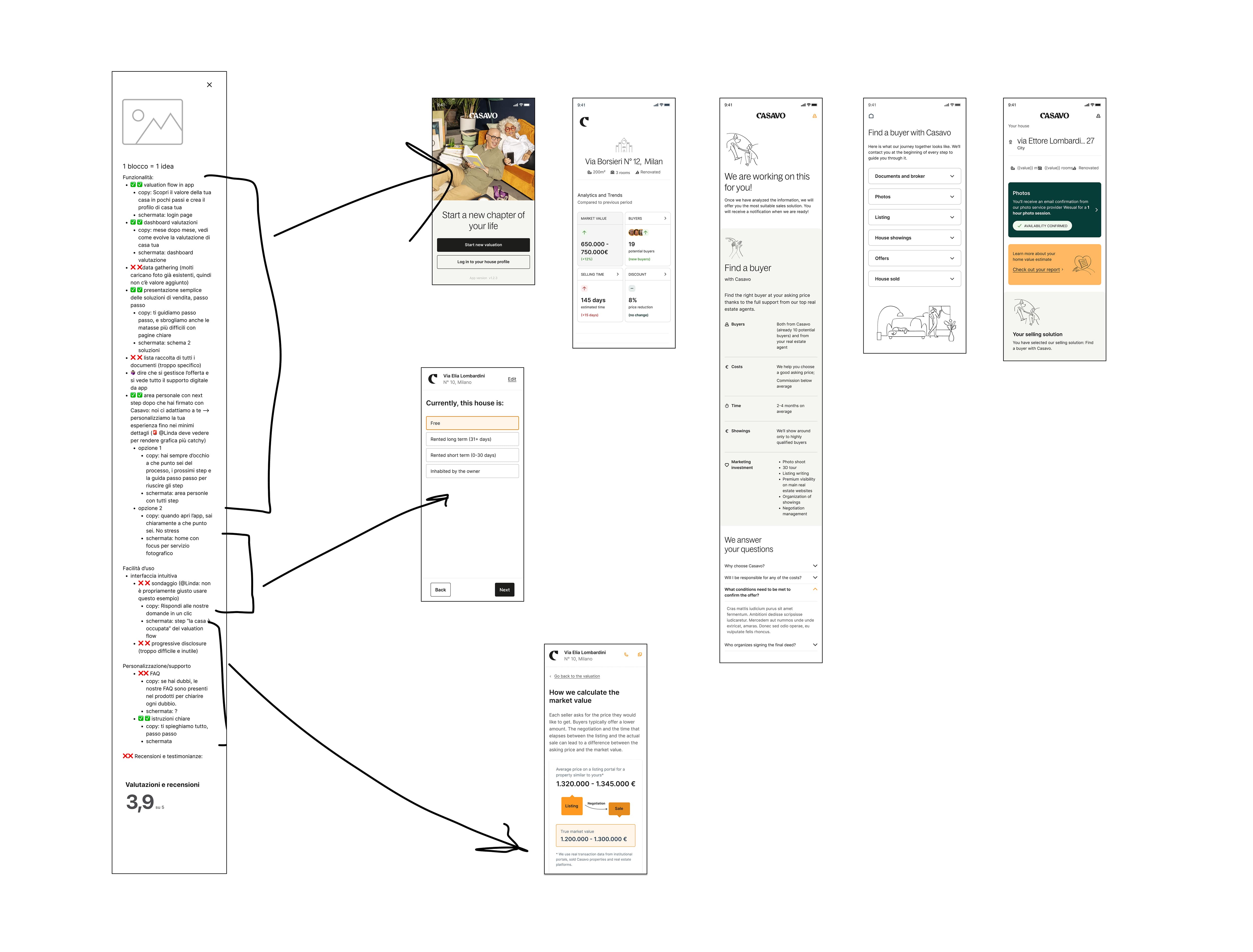
Many topics emerged from the workshop, topics we ourselves were not quite sure how to group. So we asked our users for help and set up an open card sort with 20 individuals. Keeping it open could have led us to incongruent results, but we didn’t want to influence users in any way with predefined clusters.

Main insights
These insights are related to specific parts of the IA we had doubts on:
Users split topics related to how the company speaks about itself (”Who we are”) and what others say about it (”About us”).
Users grouped guides and other informative material inside a cluster named “Advice” (we would identify a proper naming afterwards).
FAQs were quite tricky to group because they can be related to more than one topic.
We took the clusters suggested by our users and prioritized them in the interface according to the business strategy. Some topics users considered important were indeed not priority 1 for the business, as its primary focus is on guiding them to transactional products. We had to consider how to address both needs when designing the navigation.
Design
I developed low fidelity wireframes showing how I would visually redefine the website’s information architecture. This implied a redesign of the navigation system.
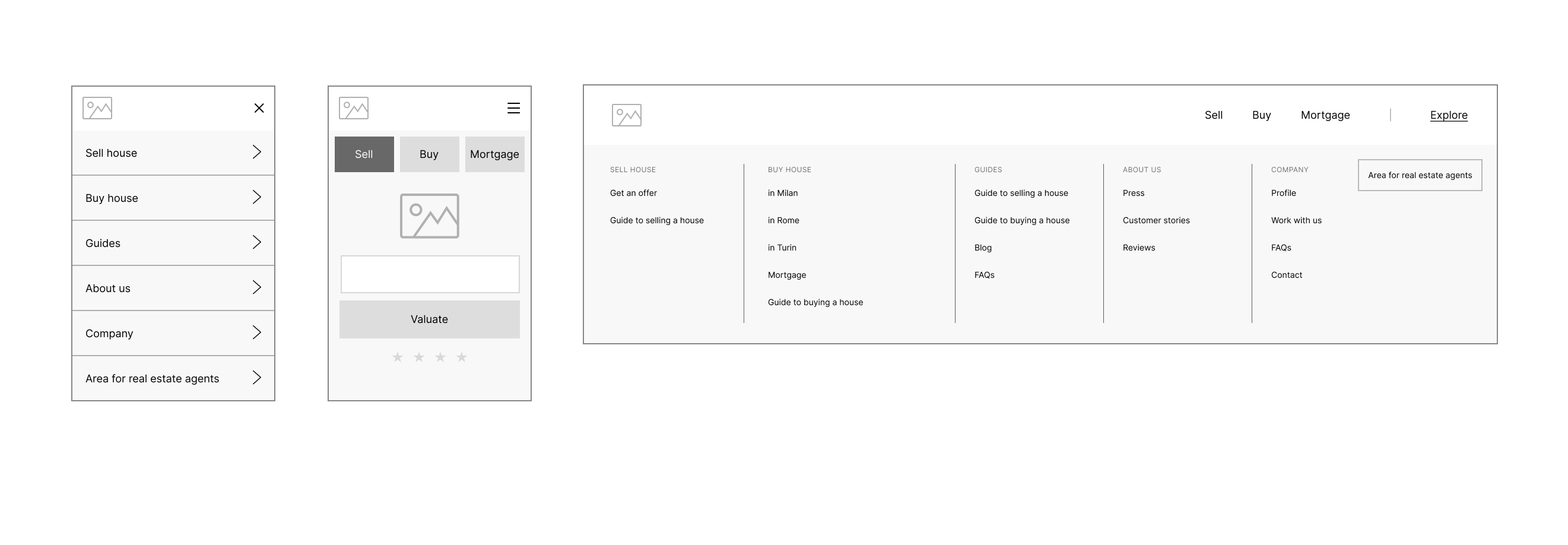
I prioritized business needs by guaranteeing fast and easy access to transactional products (selling, buying and mortgage services). I extrapolated these items from the hamburger menu and created a fixed navigation menu just below the main one, so that users would be able to have access from any page while browsing. The rest of the clusters were arranged in the hamburger menu based on relevance. On desktop, hierarchy was achieved by grouping all secondary topics inside a dropdown labelled “Explore”.
Validation
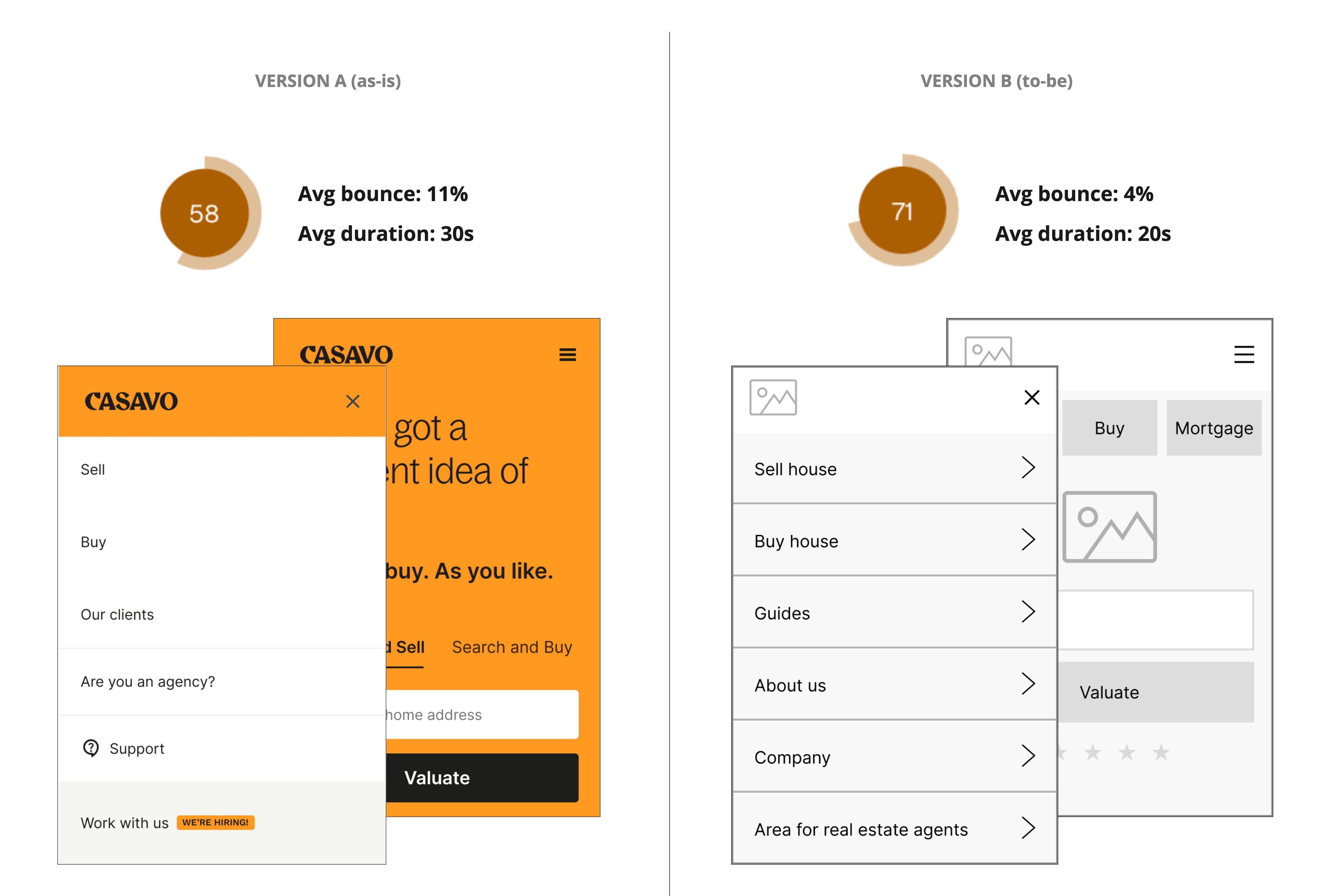
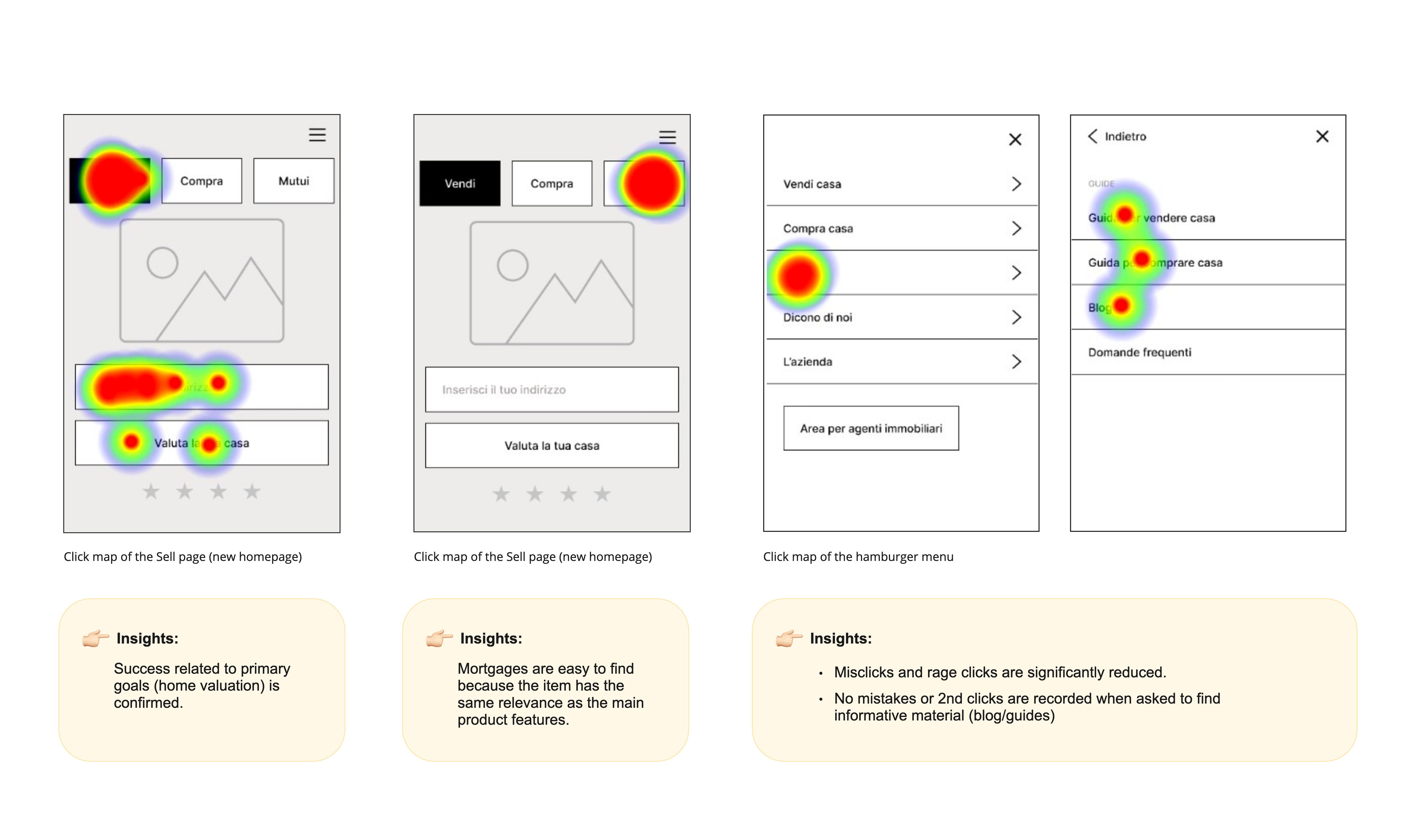
Before switching to UI-mode, we tested the lo-fidelity wireframe against the website in production. The usability test was conducted with 10 individuals between 45 and 60 years old on mobile. Users were given a set of tasks to complete on both version A (control version) and version B (redesigned version). The tasks consisted mainly of locating common sections within the site. Even though version B was still a wireframe, we registered a 13-point increment in usability score, a reduced bounce rate and a shorter average duration per task.
Introducing interaction
When defining opportunities and goals, we talked about the importance of efficiently delivering our value proposition. Our brand speaks about cutting-edge technology, but our website doesn’t speak the same language. Pages are quite dull and static, leaving users with a plain reading experience.
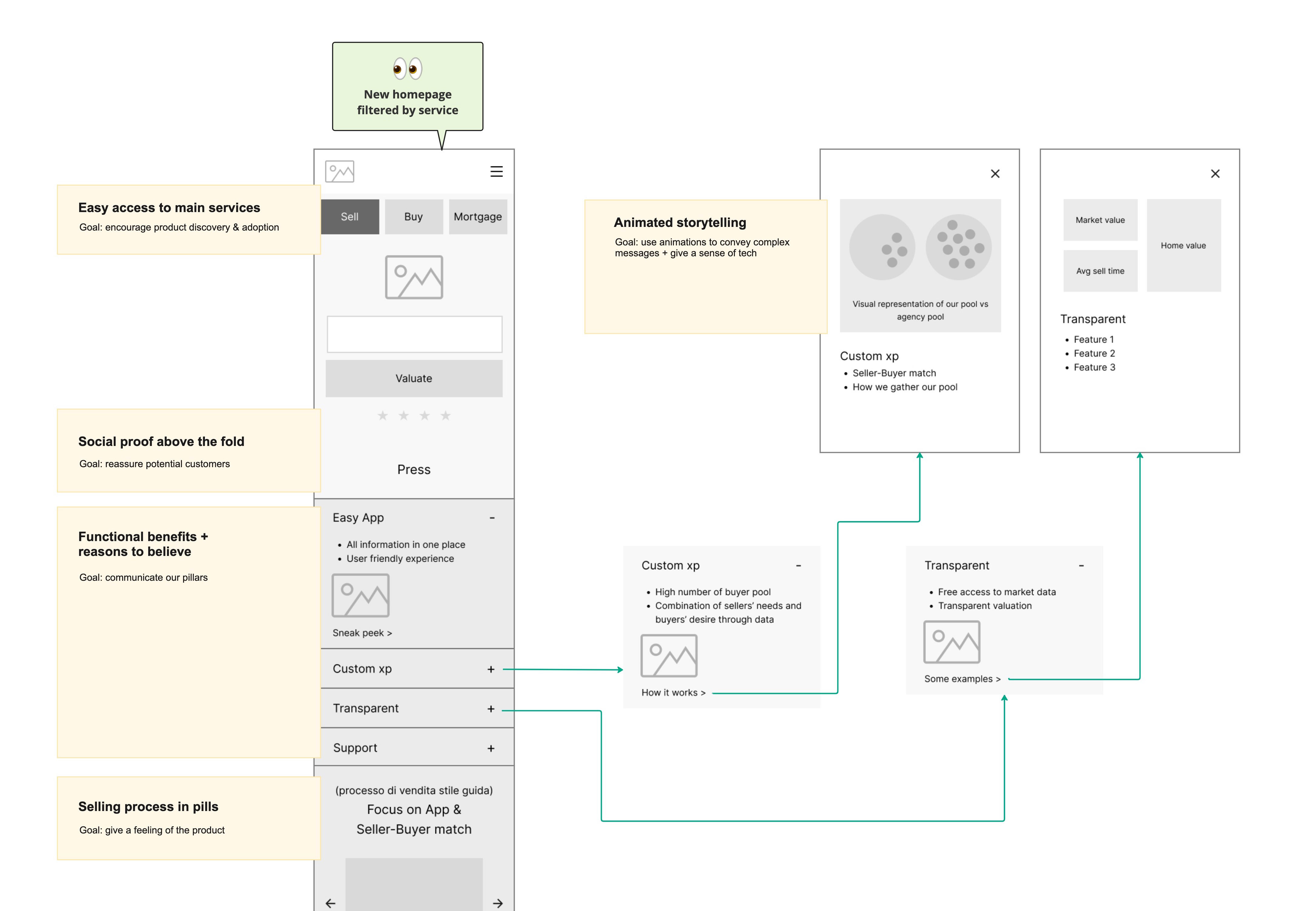
I was convinced we could make the experience way more engaging for users by introducing interactivity and dynamic content. So much can be achieved by letting users discover a product rather than explaining it to them with words. I started thinking of interactive components like accordions and carousels that could help us both in improving interaction and reducing the page’s length. Incorporating animations would have been interesting as well: tech firms often use them to explain complex topics and to convey a sense of modernity. As a product designer with motion graphic skills, I suggested this idea to the team and everyone was excited!
Designing the UI
As I approached the UI phase, it was important to gather input from internal stakeholders, especially from the brand team. Our brand had to convey values such as simplicity, clarity and joy, while keeping an eye on tech and innovation. I benchmarked websites of both competitors and tech industries to gather inspiration.
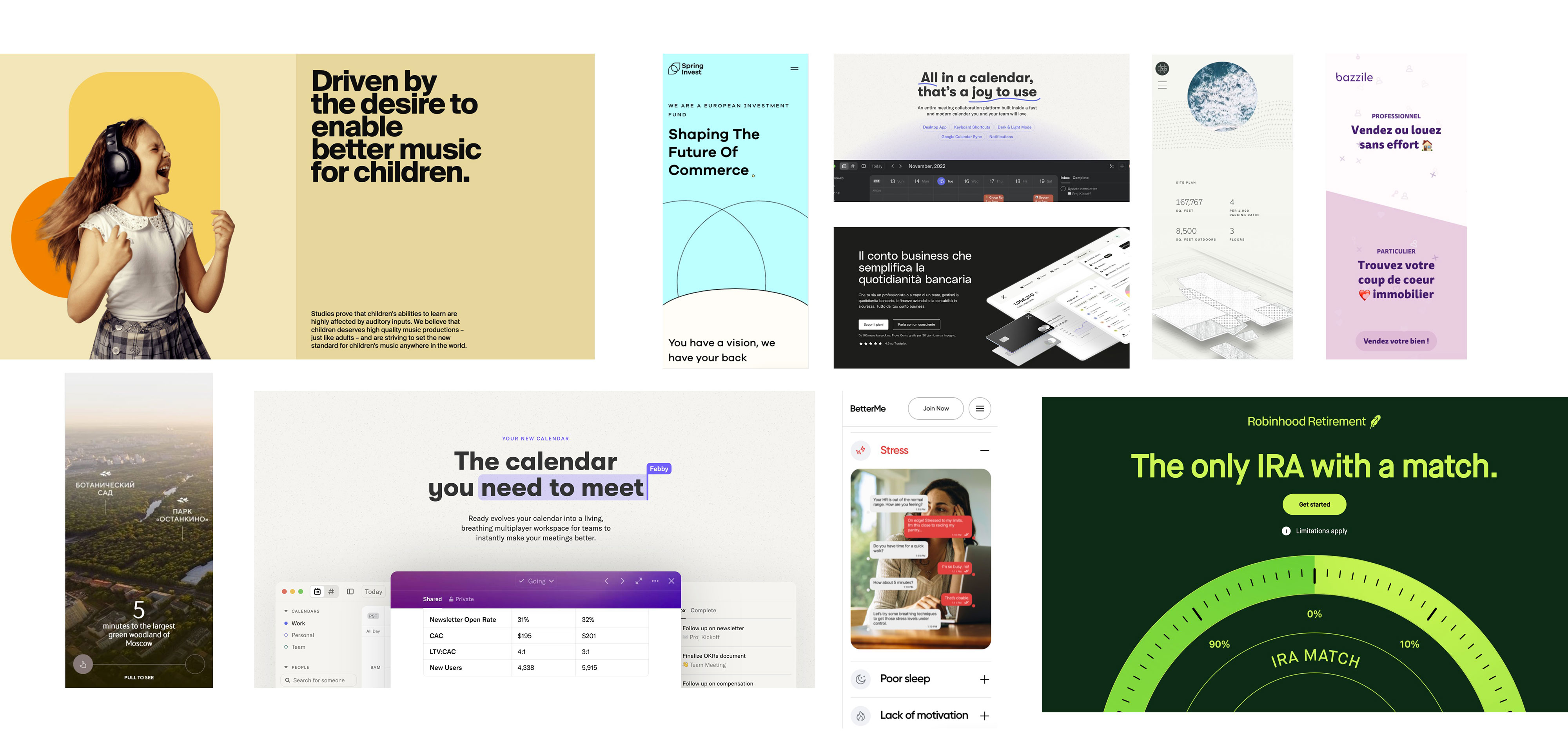
The final UI was the result of the following criteria:
- Mobile first layout
- Focus on simplicity
- Interactive and dynamic
Communicating simplicity
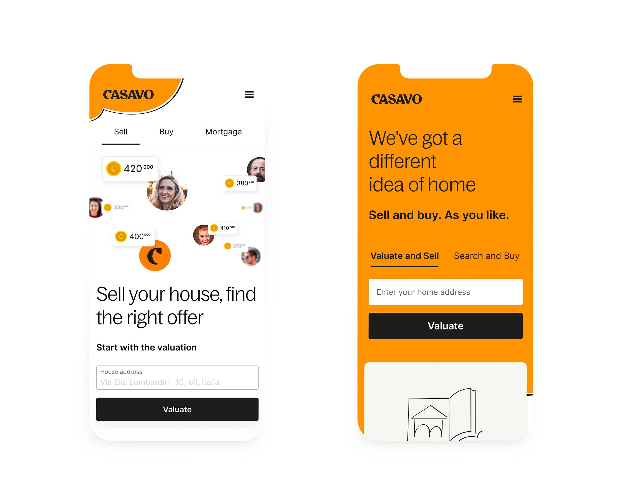
The value proposition in the hero section was the hardest to design because of the complexity of the concept behind it. The benefit we wished to communicate was the following: sellers can select their buyer from a vast pool and choose the offer they prefer.
value proposition
Sellers can select their buyer from a vast pool and choose the offer they prefer.
I set up 5-second tests for every iteration with users to be sure the message would be correctly delivered. This version was the simplest in terms of design and proved to be the most efficient.
"What is posted on the web reaches more people."
"Helps avoid real estate agents."
"Modern and fast technology."
Reducing text chunks
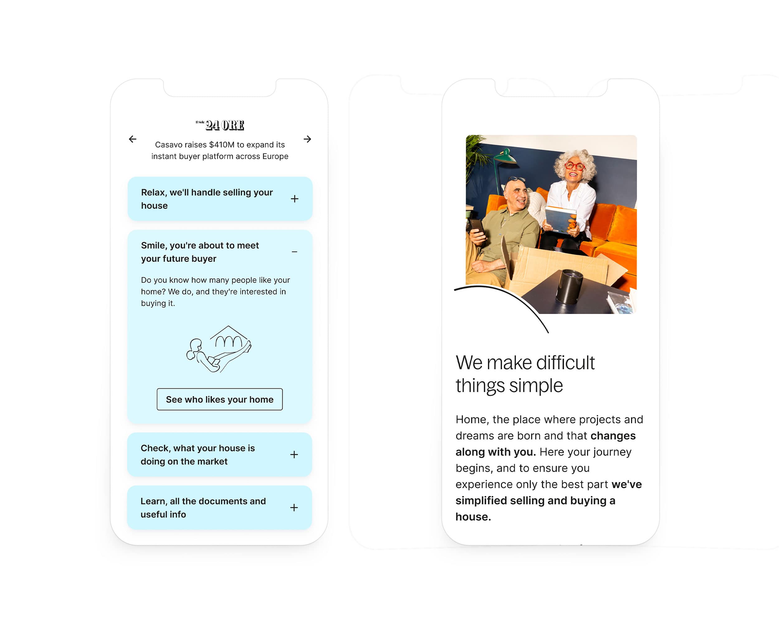
What was narrated in heavy chunks of text has been summarized in interactive accordions. Focus shifted from what mattered to the business to what mattered to users, highlighting advantages and benefits. Each accordion features a call-to-action to dedicated modal windows where users can find animations and product sneak peaks.
Feeling the product
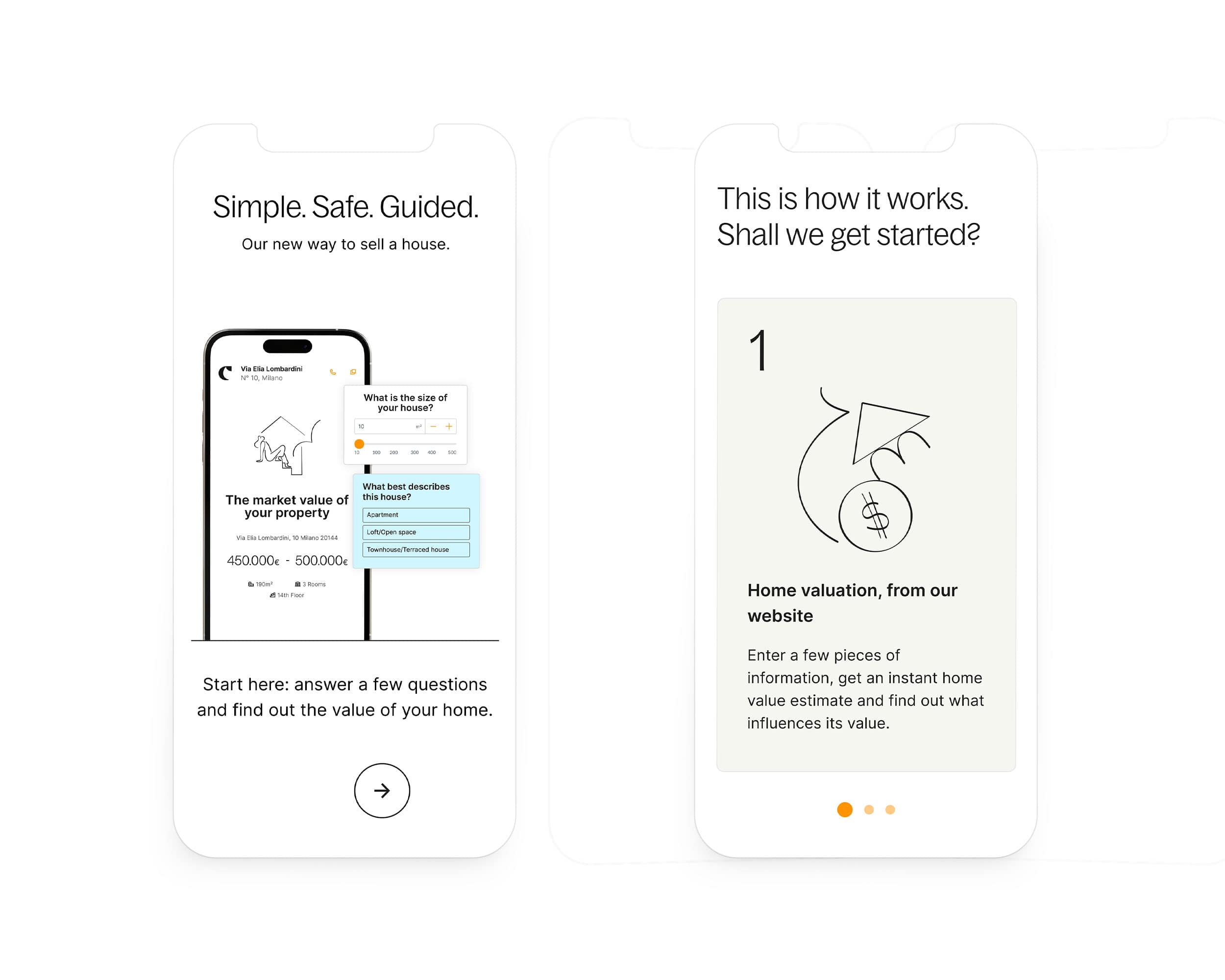
Product screens were chosen over illustrated content to better communicate the selling process. I believe that giving a sense of using the product is better than just speaking about it.
Analyzing outcomes
Two weeks after deploy, we checked how the new homepage was performing. If we refer to our product goals outlined earlier, we wanted to boost product adoption by increasing user engagement. We set a series of actionables aimed at encouraging navigation, keeping users on the website and improving communication effectiveness.
This means looking for:
product adoption
Increase in conversion rates from sessions to qualified leads
usability
Increase in visits to product pages
engagement
Increase in user interaction
These metrics mean nothing if analyzed individually, but can be success indicators if considered together.
Product adoption
Are users starting to use our products more than before?
We launched an A/B test in production to be sure the new design wouldn’t impact negatively on conversion rates.
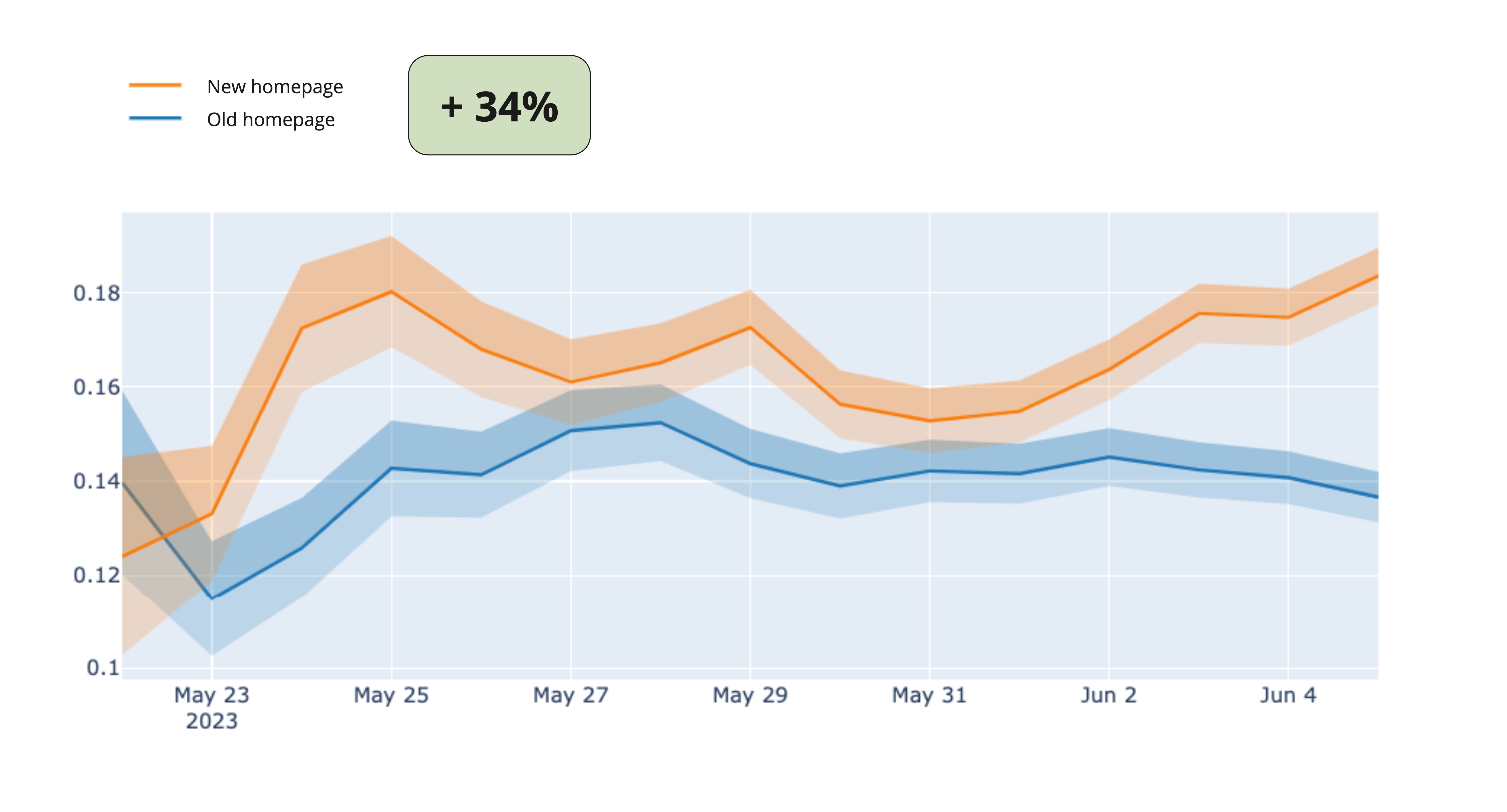
The new homepage has a statistically significant impact on Conversion Rate, registering an increment of +34%. Thanks to these results, we could affirm that the new design was outperforming the old one in terms of attracting and converting users.
Usability
Are users visiting product pages more than before?
One of the major updates in our information architecture consisted of extrapolating the business’s services from the hamburger menu on mobile devices. Let’s search for increments in visits to product pages:
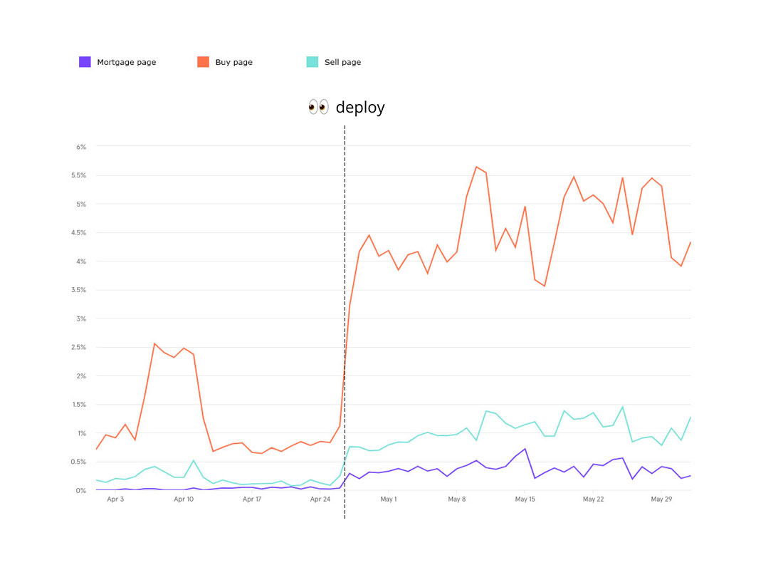
We registered a positive trend starting from the deploy (Apr 27). Accessing the main services seemed to be easier for users, especially when visiting the website from mobile devices where every entry point used to be hidden in the hamburger menu.
Engagement
Are users spending more time interacting with the website’s content?
We measured how much time users are actively spending on the homepage after vs before the deploy:
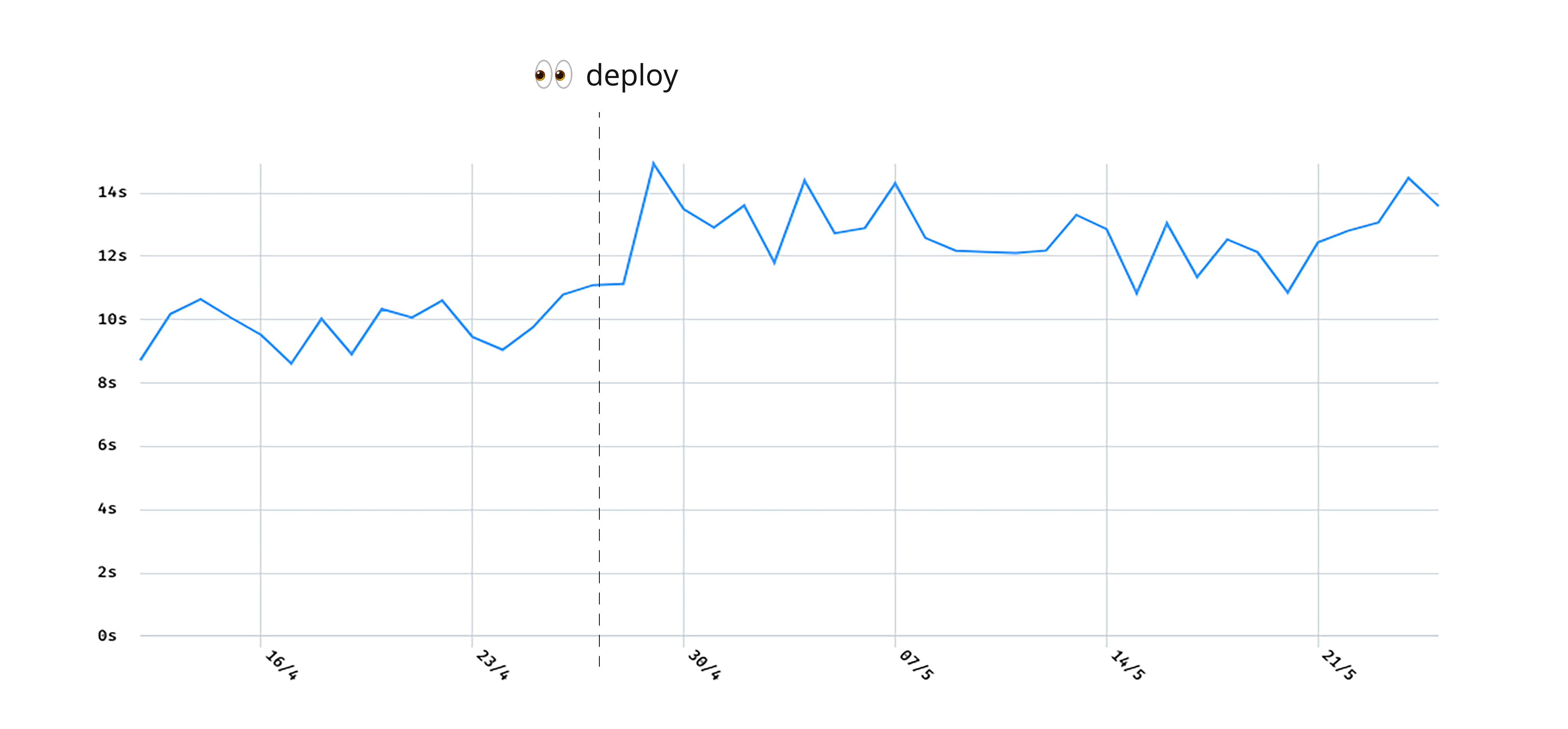
Users were spending more time on the homepage since the deploy (Apr 27). This was a sign that the page itself was performing better in terms of engagement, but we took a step back and looked at the website globally: were users exploring it more than before?
| Bounce rate | Exit rate | |
|---|---|---|
| New homepage | 43.3% | 48.3% |
| Old homepage | 52.1% | 57.3% |
| -17.0% | -15.7% |