The Process
- Ideation, Articulation and Development
- Mapping, Testing and Envisioning
- Wireframing and UI Design

Ideation, Articulation & Development
"Good ideas come from good problems, real problems which can be solved. Most of the times an app isn't enough to solve a problem but, when it is, users are going to love it!"
As my teacher at CalArts used to say, having a real problem to solve is the most important starting point when designing a solution. For this assignment, no particular brief was given. Students were free enough to come up with their very own idea. As my teacher said, the idea had to potentially solve a real problem. The only constraint given was to try and come up with a solution that would solve a problem for ourselves.
So I started thinking about what kind of problems I would like to solve with an app. As a passionate traveller, I visited different places around the world. Despite my good communication skills, sometimes I wished I had known someone living in the place I was visiting just to have a point of reference tu turn to. That's when my idea was planted in my head.
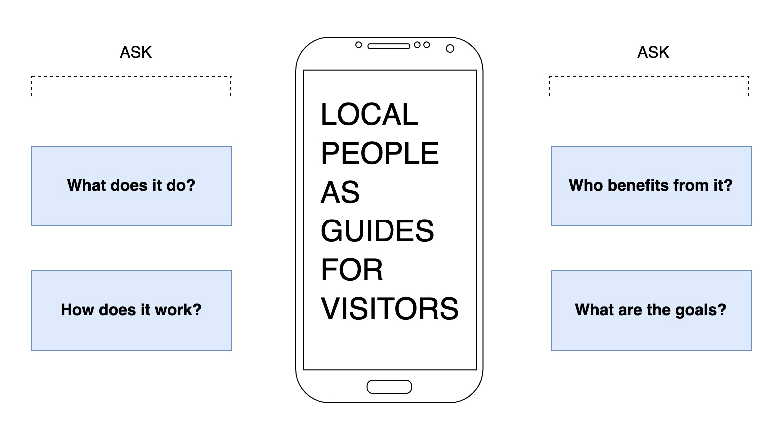
My Idea: local people as guides for visitors.
The idea was broad and could be developed in infinite ways. In order to focus the idea, I had to articulate it more by asking and answering the following questions:
- What does it do?
- How does it work?
- Who benefits from it?
- What are the goals?
Ideation - What does it do?
To come up with a clear idea of what the app would do, I had to explore all the possibilities first. I put down a list of functions from the most to the less important:
- Enables visitors to book an experience with a local guide
- Enables local guides to upload an experience
- Tracks the user’s interests to suggest the most relevant experiences
- Keeps track of history and upcoming experiences
It was useful to create a hierarchy of the functions of the app in order to know which of them is the most important. Idea number 1 was the one I would articulate, while the others were less important. Focusing on that big idea helped me communicate what the app would be about and articulating it in a one-line description:
My app suggests ordinary people as local guides for unique experiences.
Research and Development - How does it work?
I checked out the competition. I categorized my research in 4 groups: apps that already exist and do the same thing, apps that do something similar, apps that are content adjacent, unrelated apps that might share a structural model. The main competitors I considered were the following:
- Airbnb - a digital platform where people book a place hosted by locals. There is a section where people can host their experiences and share them with others;
- Lonely Planet - a digital platform inspiring travelers with trusted content from experts who visit every destination;
- Tripadvisor - a digital platform where users can search for a destination, an attraction or an activity and read other traveller's reviews;
Based on the research, I discovered interesting ideas and features that could fit perfectly in my app. I wrote them down and checked the ones that seemed to be feasable.
Audience and Rationale - Who Benefits from it?
At this point it was time to define my audience. In order to define my initial user target group, I started thinking about what traits these users might have. Going from general to specific then, I tried to describe them in a more detailed way. By the end of the analysis, I was able to dfine the rationale behind why there people would want to use my app.
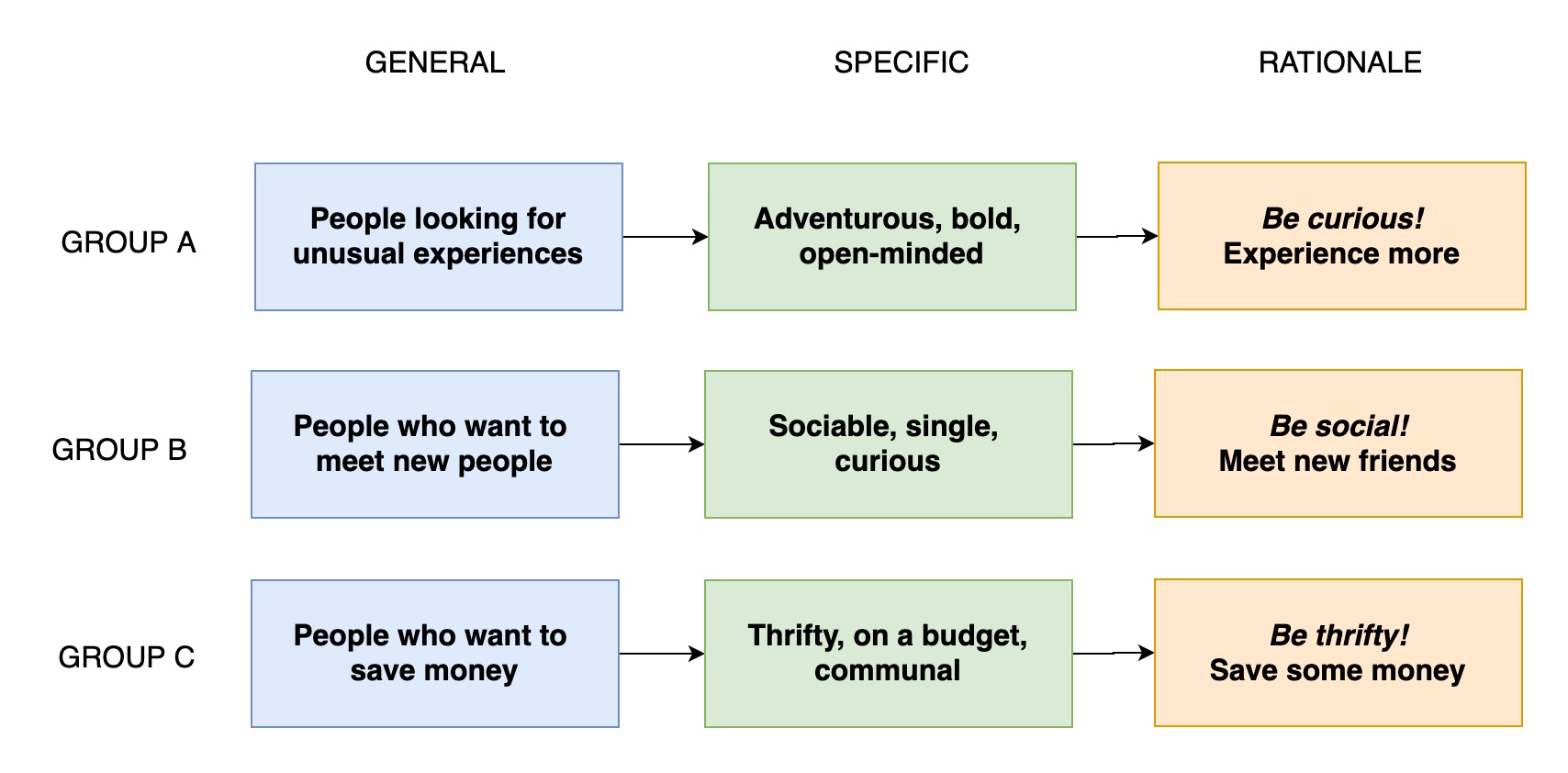
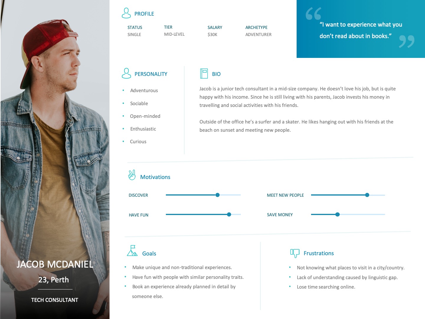
Once defined, these personality traits were used to invent profiles of what I thought typical or ideal users would be (user personas).
Goals and Outcomes - What are the goals?
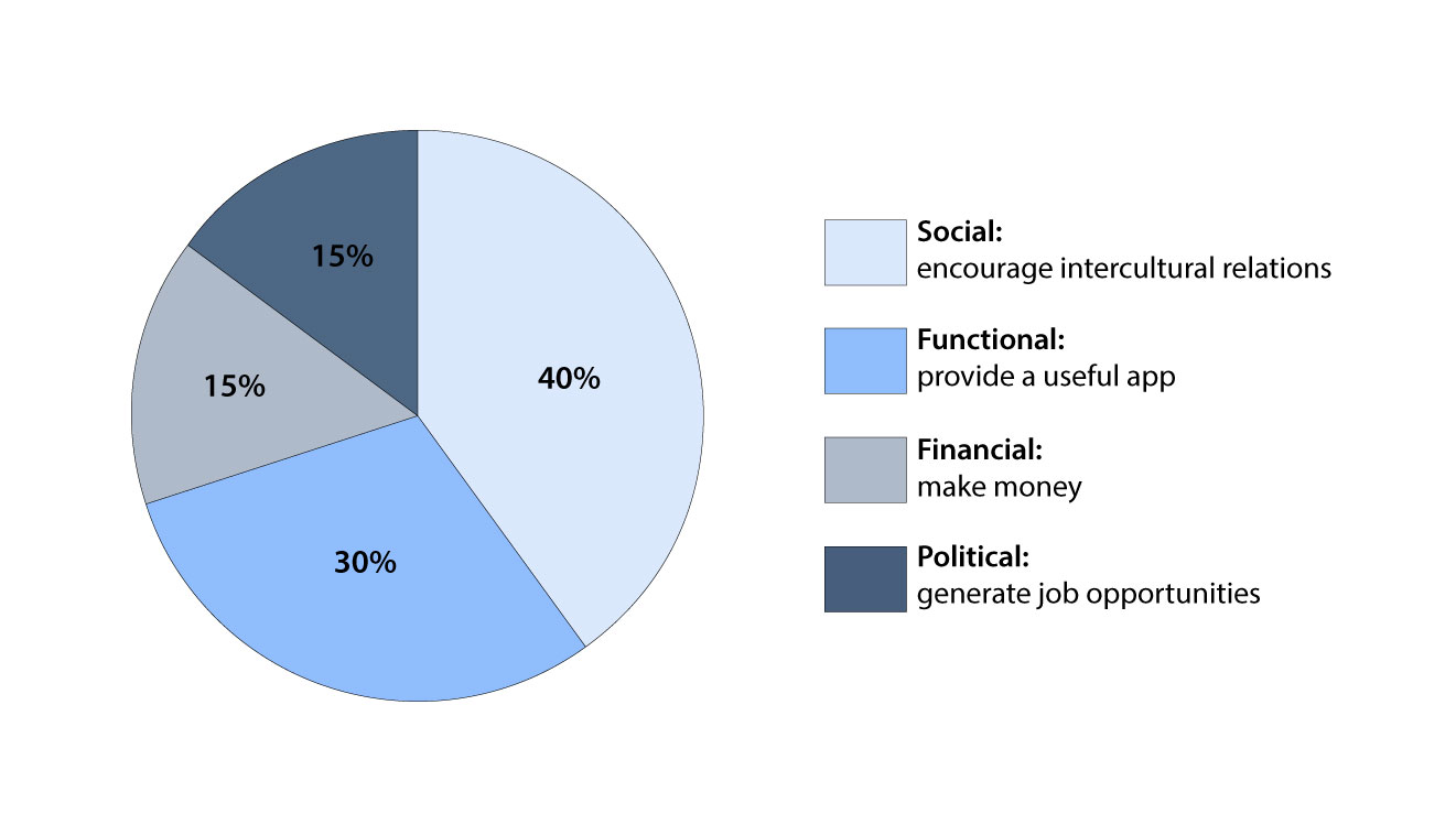
Designing a successful product means matching the user’s goals and the client’s goals. Most of the times, these do not overlap. In this case, I (the designer) am also the client, so I mapped out the goals from my point of view. In order to have a clear understanding of the app’s goals from the client’s perspective, I grouped them in 4 macro-areas: political, financial, social and functional.
Naming and Mission
Naming, tagline and mission have to work together and have the right tone and mood. They need to work as a set and be related to each other not just in terms of their content, but also in terms of their philosophy and how they use language.
I made a mind map that explored all the possible areas connected to my app’s story. I opted for a combination of two words: local and eyes. When putting the two words together, you get the name Localeyes which sounds exactly like the word “localize” with a more human tone.
The tagline had to be catchy and succint. It’s the thing that advertises the brand and gets to the heart of what it does. Sharing a window to our world. sounded like a good tagline because it went straight to the heart of what my product wanted to do. I went deeper in describing my app with a brief mission statement:
Localeyes is an app that helps visitors have a good time in a foreign place by suggesting ordinary people as local guides for unique experiences. Discovering local traditions with a native is so much better for travelers because local guides know exactly where to bring them and don't experience the gap caused by linguistic misunderstandings. Localeyes is a chance for travelers to get to know local people who share their expertise and a window to their world. It is also a chance to meet new people from all over the world while learning something together.
Mapping, Testing, Envisioning
Mapping content and interaction
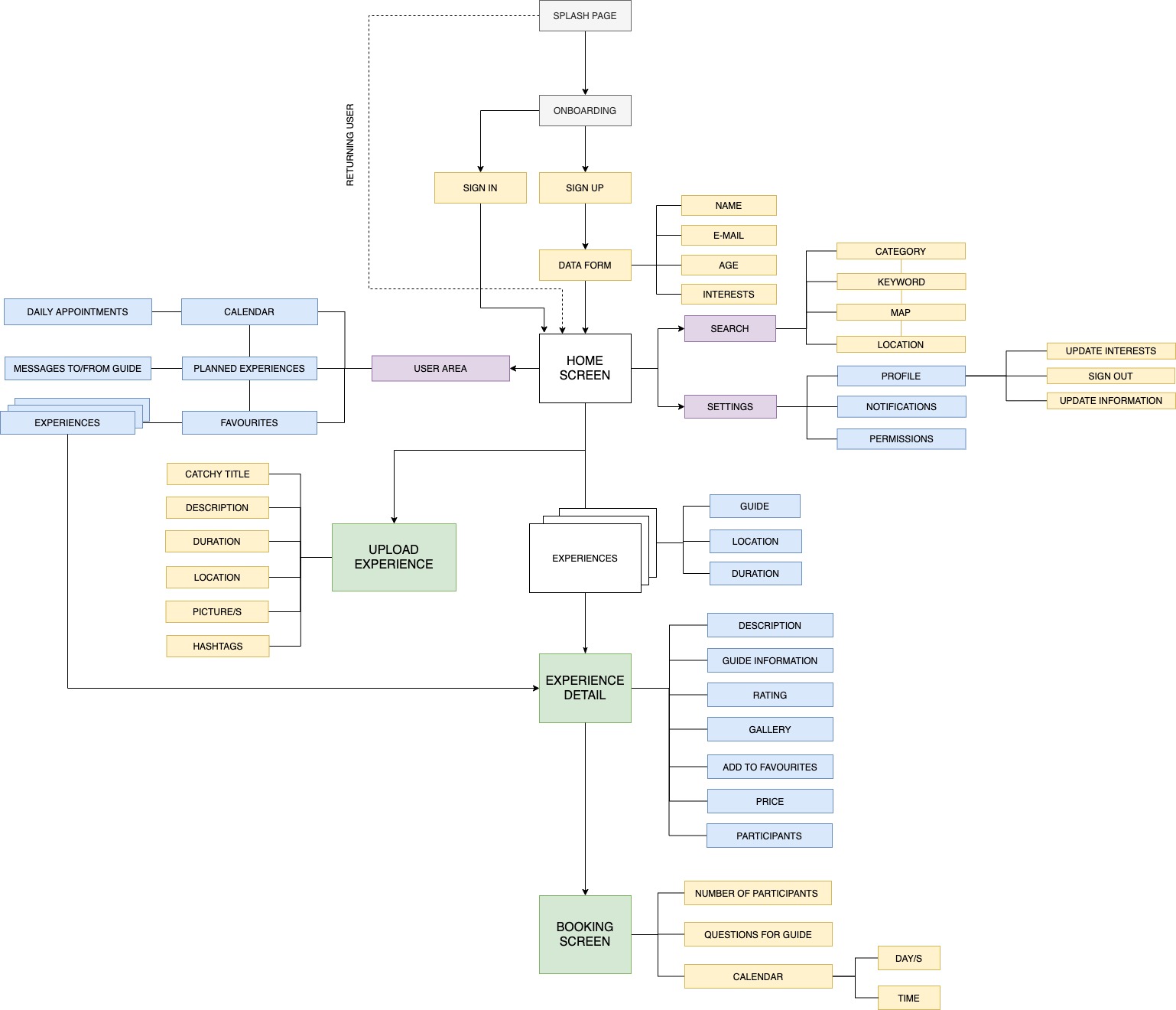
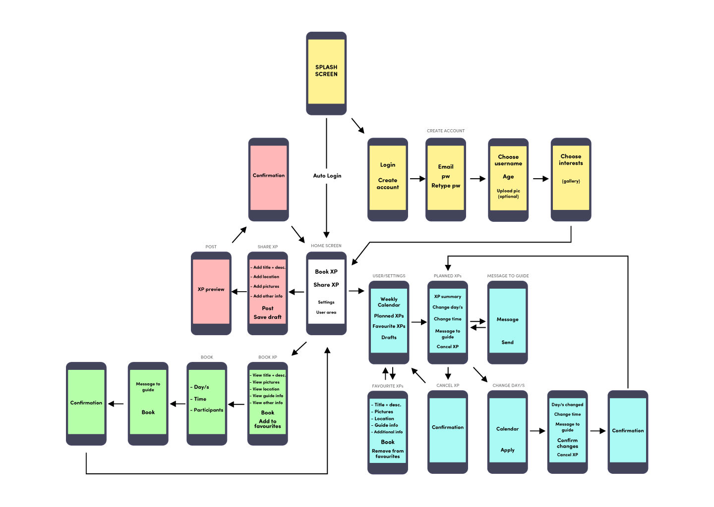
A content map was designed to map out the architecture of the app. I set up a system to describe our content based on hierarchy and modularity. Green represents major events: book and upload an experience. These had to be the two main features accessible from the home screen. Less important sections would be related to the settings, the search and the user area. A third level of importance was coded in blue and yellow (if user input was required).
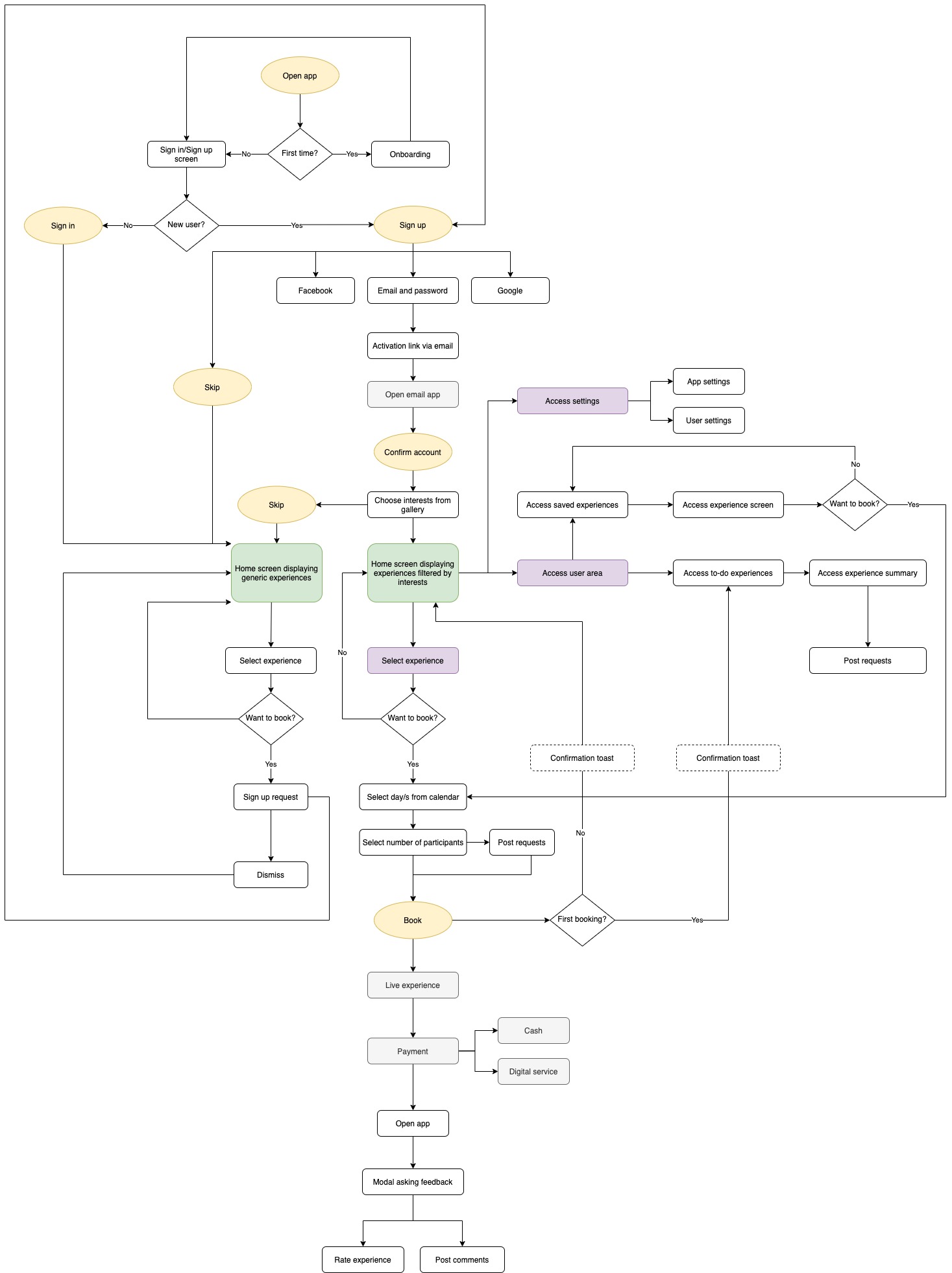
In order to understand how a user would go through the content, I designed a flowchart of user pathways. The diagram considers every possible path the user can take when facing a decision.
Non-Visual User Testing
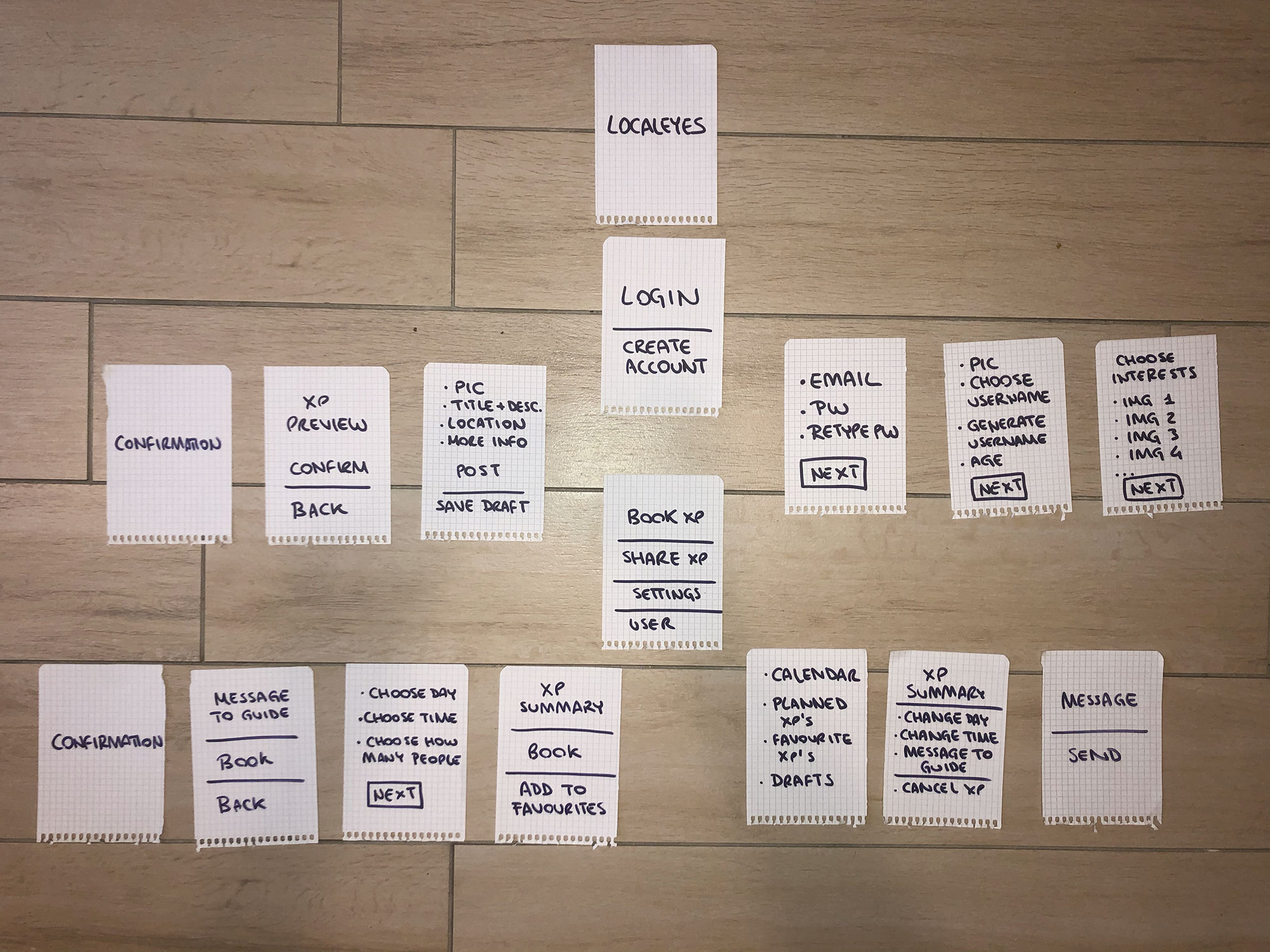
I developed a paper prototype of my app, which was based on the two maps that I had created. I took each step of the user experience and divided it onto individual pieces of paper, so that the user could make decisions based on the information in front of them, without the distractions of design. This allowed me to test whether any steps were missing from the user's journey.
Site Map
Based on the feedback I got from my preliminay user testing, I built the sitemap of my app. I created different screens for every user decision illustrated in my interaction flow chart. I color coded the sections of the map so it was easier for me to separate different areas with different focus.
Wireframing and UI Design
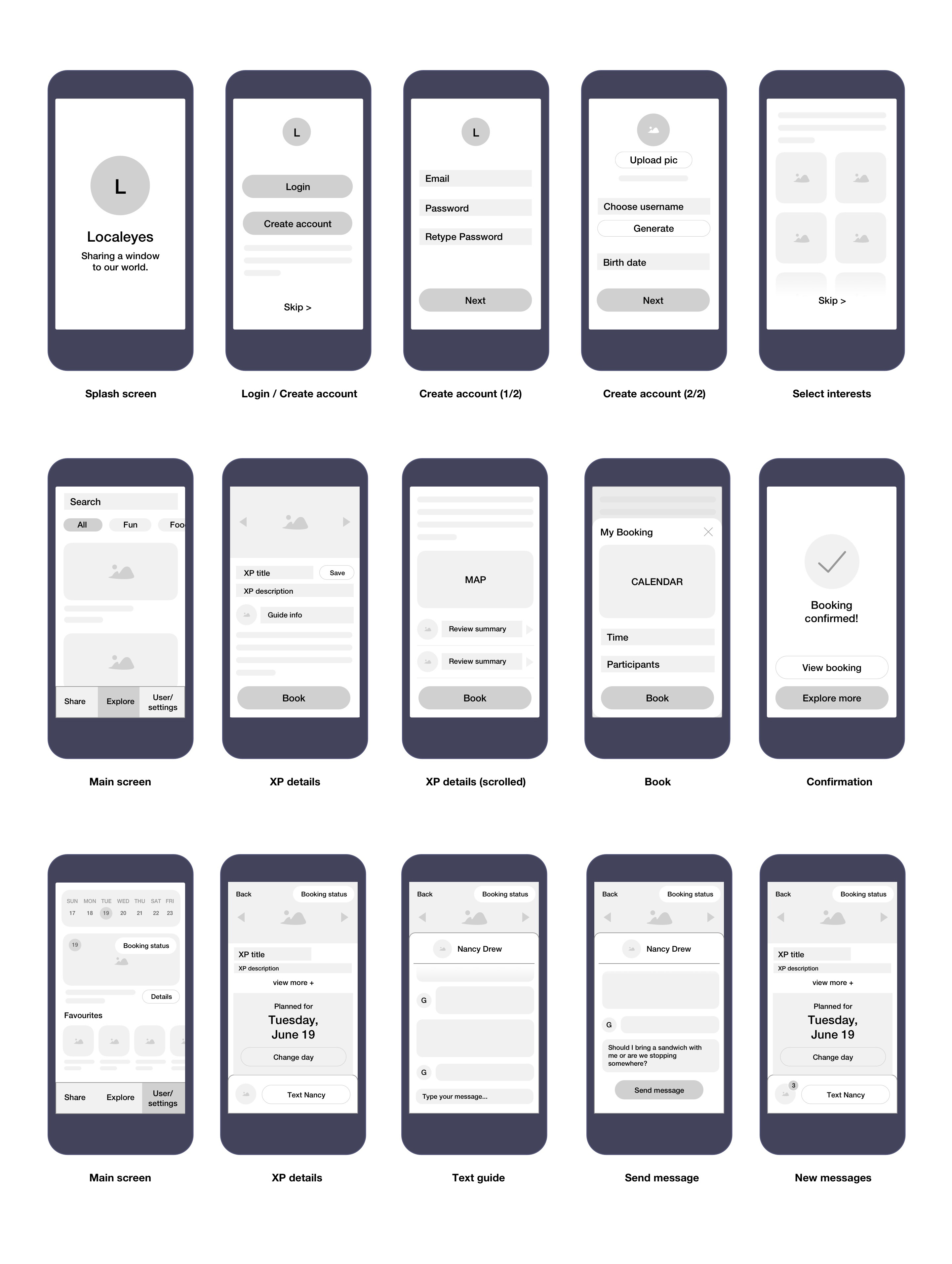
Wireframes
I used the sitemap as a roadmap to make wireframes of my app. I referenced the research I did in the initial phases of the process to detect design patterns that would fit my app's needs. At this point I identified elements that were crucial for the functionality of my app and gave them more importance in the hierarchy of information. I also thought about how the user would interact with the app in terms of gestures and displayed the information accordingly. When I was in doubt of the most appropriate pattern to use, I made more versions of the same screen and tested them out once again with users in order to get a concrete feedback.
Visual Direction
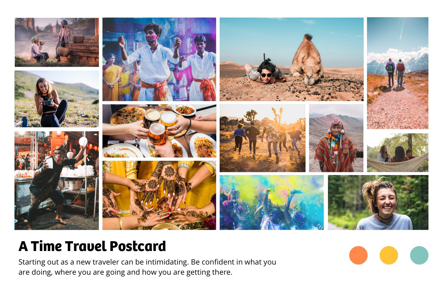
It was finally time to decide what my app would look visually look like. Because of my background in graphic design, I particularly enjoyed this part of the process. The goal here was to establish a visual experience that was appropriate to my audience and to the content I was showing. I identified the traits my three user target groups had in common in order to give the app an appropriate mood and tone: extrovert, sociable, curious. I designed a mood board that communicated these feelings and created a color palette based on the images. I chose my typefaces accordingly and went with Bree Bold for headings and Open Sans for body text.
UI Design
After having elaborated a visual direction, it was time to apply it to the wireframes to develop a user interface. At first I made rough and sample screens to test and develop my design direction. This involved testing different color palettes, visuals and typographic scale. I tested out two different versions of my app on a set of screens and chose the one that best responded to both aesthetics and functionality.
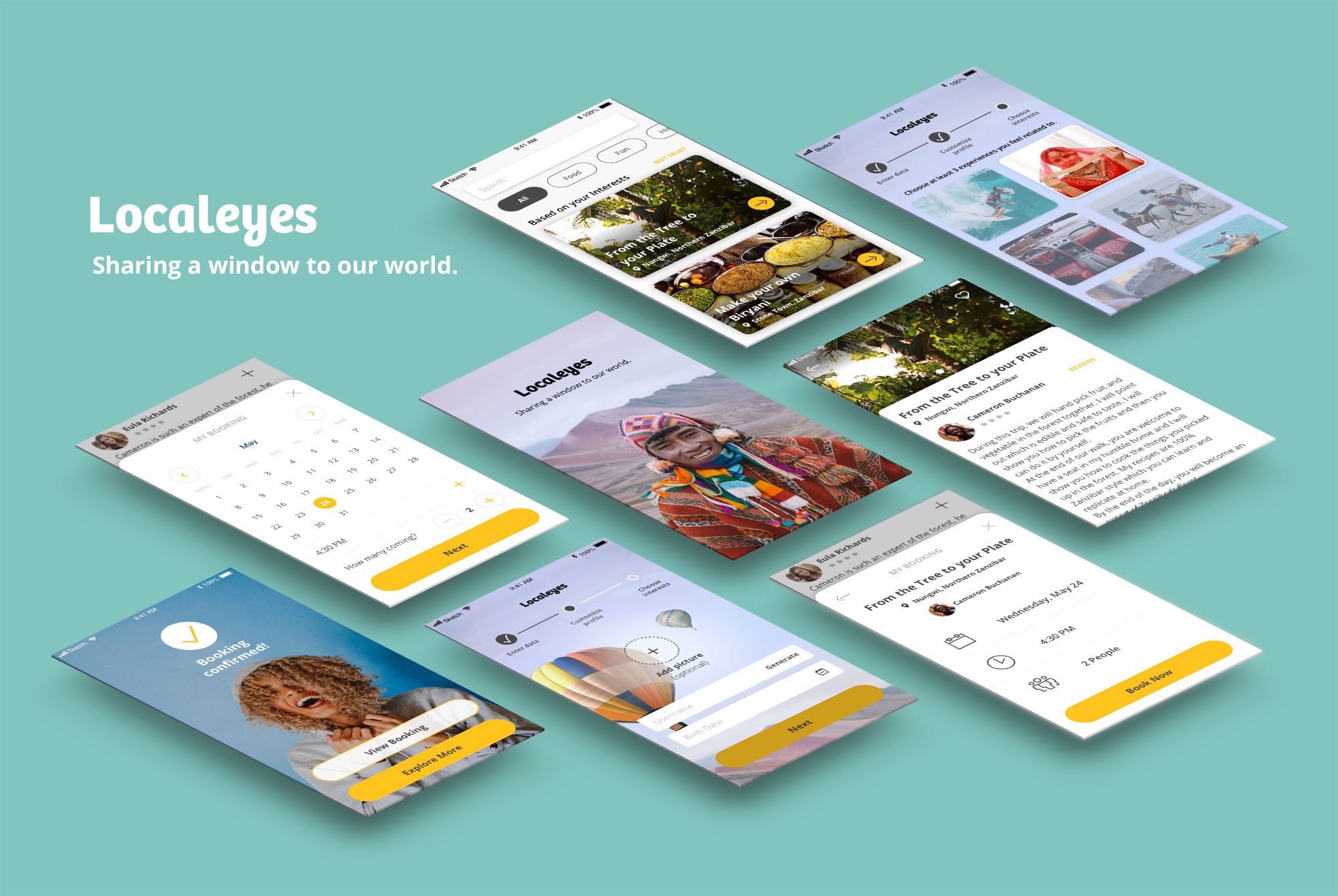
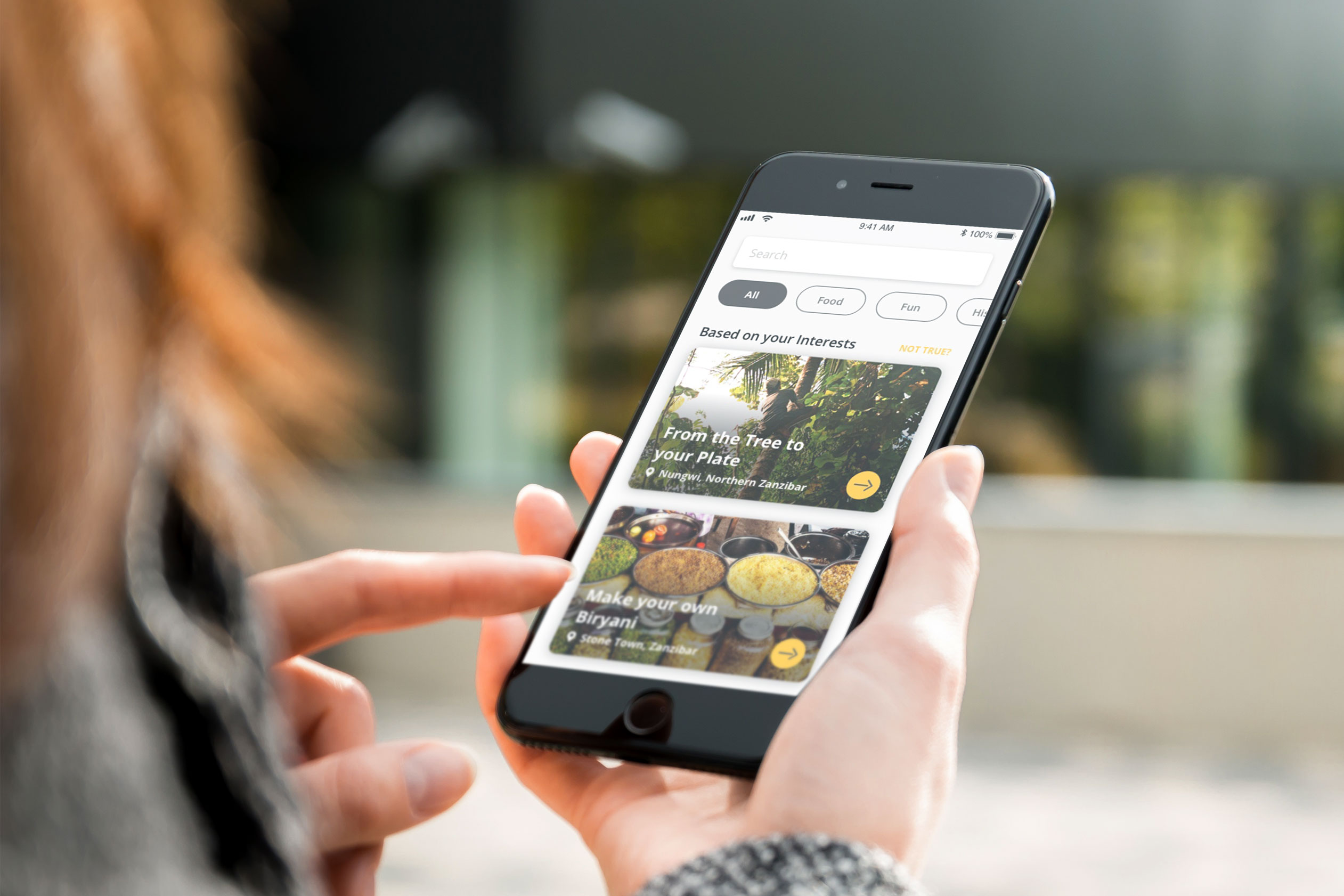
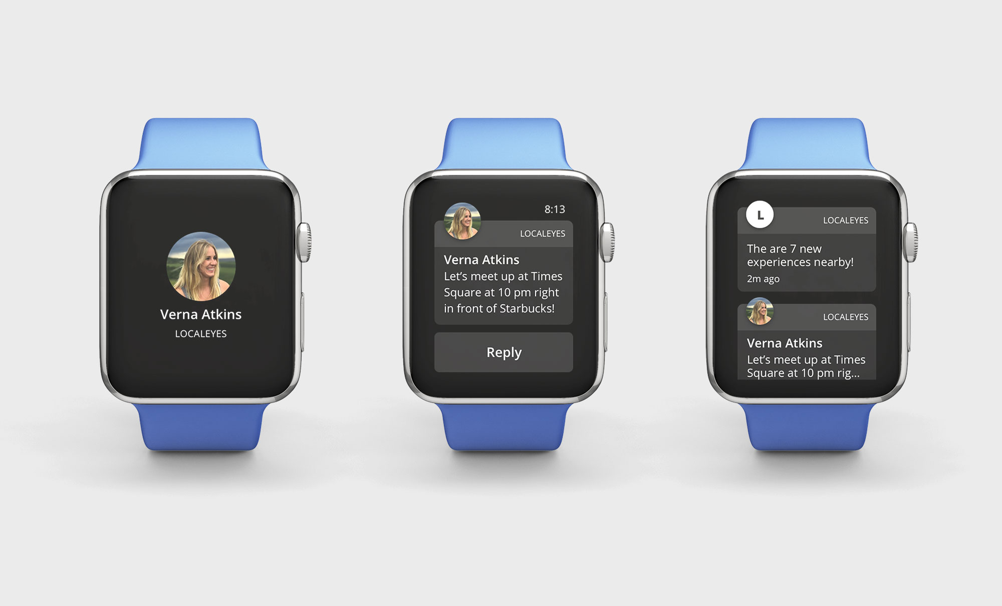
Localeyes was going to be used on the go. It was important to keep visitors informed on their upcoming experiences even if their phone was far back in their backpack. Compatibility with smart watches had to be considered as a valuable nice-to-have for future releases.
