Date: 07 July, 2016Type: PrintClient: Midsummer Fest
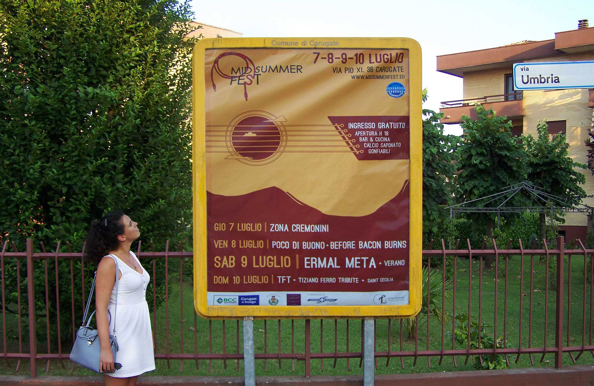
The Midsummer Fest is a music festival in the city of Milan which takes place every year during the summer. The festival is a great place where emerging talents can perform and - hopefully - be noticed. This is a great project that involves both my technical and creative skills in designing a Manifesto.
Read on for further details and insights.
Date: 07 July, 2016
Type: Print
Client: Midsummer Fest
The Midsummer Fest is a music festival in the city of Milan which takes place every year during the summer. The festival is a great place where emerging talents can perform and - hopefully - be noticed. This is a great project that involves both my technical and creative skills in designing a Manifesto.
Read on for further details and insights.
I particularly enjoyed this project because it gave me a chance to be Creative. Yes, with capital C.
In summer 2016, a friend of mine talked to me about this music festival called The Mid Summer Fest, which was being organized by a guy he knew. It was a summer event organized by an oratory based in Carugate, with music and games for everyone, young and old, kitchen and bar service. The party was strictly free and was organized and managed by volunteers, who with great dedication and passion were committed to offering an extraordinary party every year.
What the organizers needed was a manifesto to communicate their festival. When it occurred to them that I was a graphic designer - ta-da! - they thought about having a chat with me. We met at a pub and discussed the brief in front of a beer. The particularity of this festival was that it gave young talents the opportunity to perform on stage and, if lucky, get noticed. There was no dominant genre: from blues to metal, it didn't matter as long as you had talent. As a nice to have, the mood of the manifesto could be related to the summer season and to nature as the festival was prepared outdoor. I took some notes, went back home and started brainstorming.
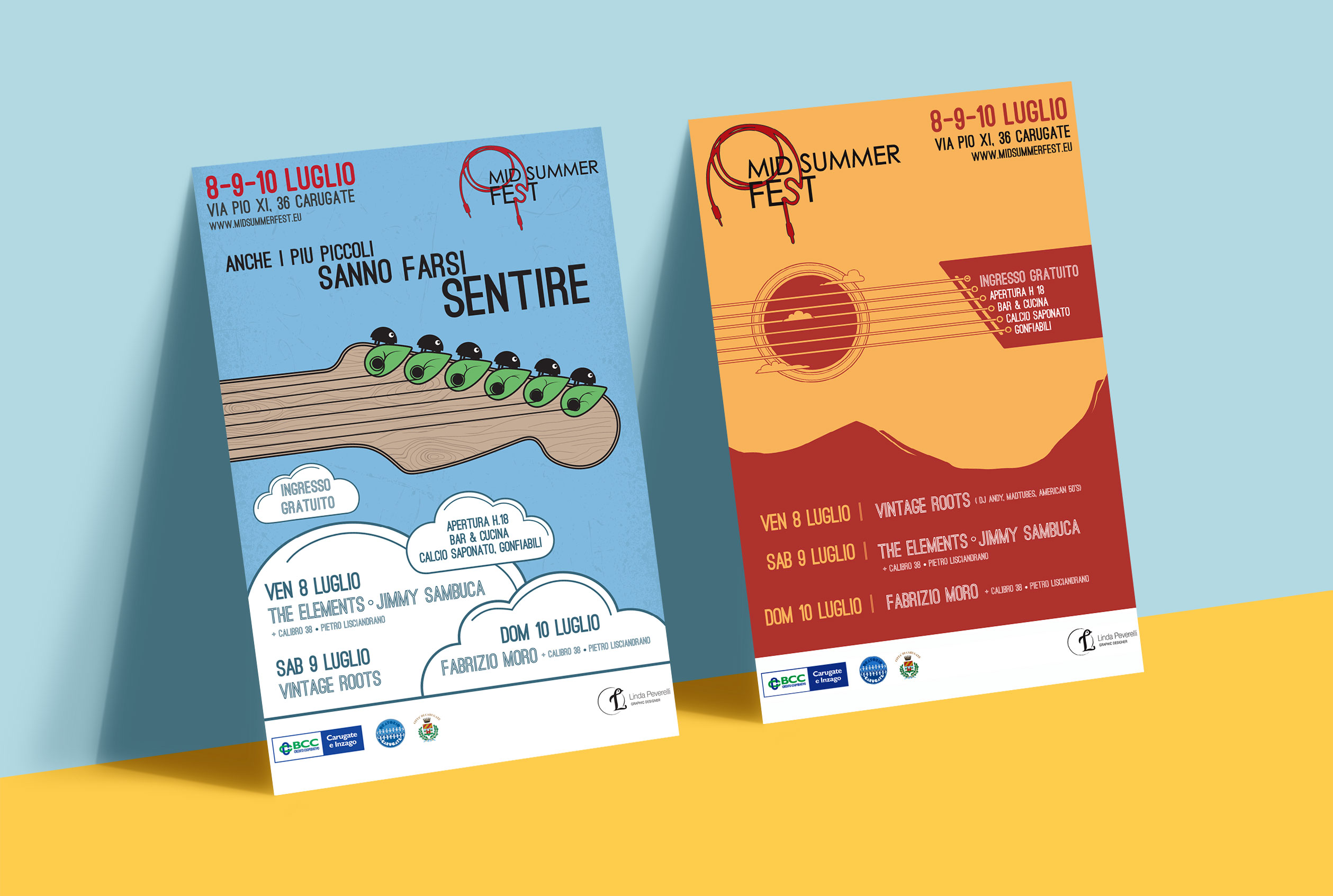
I came up with two concepts. The first one (my favourite) met the requirements of music, nature and youth. I thought about representing the close-up of a guitar's tuning pegs as if they were little bugs on a tree. The chords resembled the tree's veins. The claim had to reflect the content of the communication, so I went for an enlarging effect: "even small ones CAN BE HEARD". I gave the design a retro style by applying a stylized tree texture on the branch and a grunge effect on the sky. The name of the bands could be applied into minimal, flat clouds. I absolutely loved the output.
Concept n. 2 focused on music, nature and summer. I depicted a stylized guitar in a summer sky. In my design, the silhouette of the mountains resembled the contour of the guitar, while the round sun looked like the sound hole. The choice of the colors matched the hot season: yellow for the guitard, red for its parts. I decided to insert the bands inside the guitar's bridge.
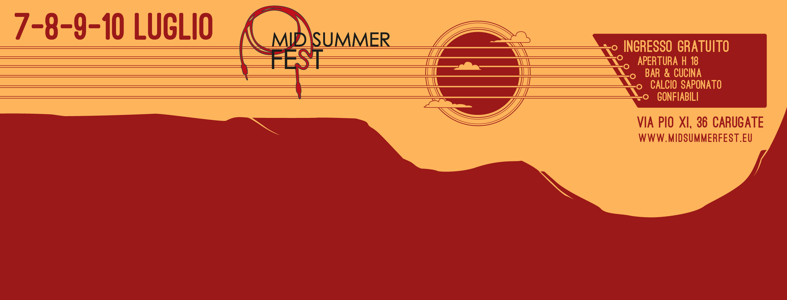
Version 2 won the duel and was chosen as the festival's manifesto. The designed was declined on posters, flyers, passes and for online purposes. While I was designing the facebook page of the event, it occurred to me that a horizontal layout made the guitar stand out even more.