Date: 04 March, 2013Type: UX/UIClient: Allianz
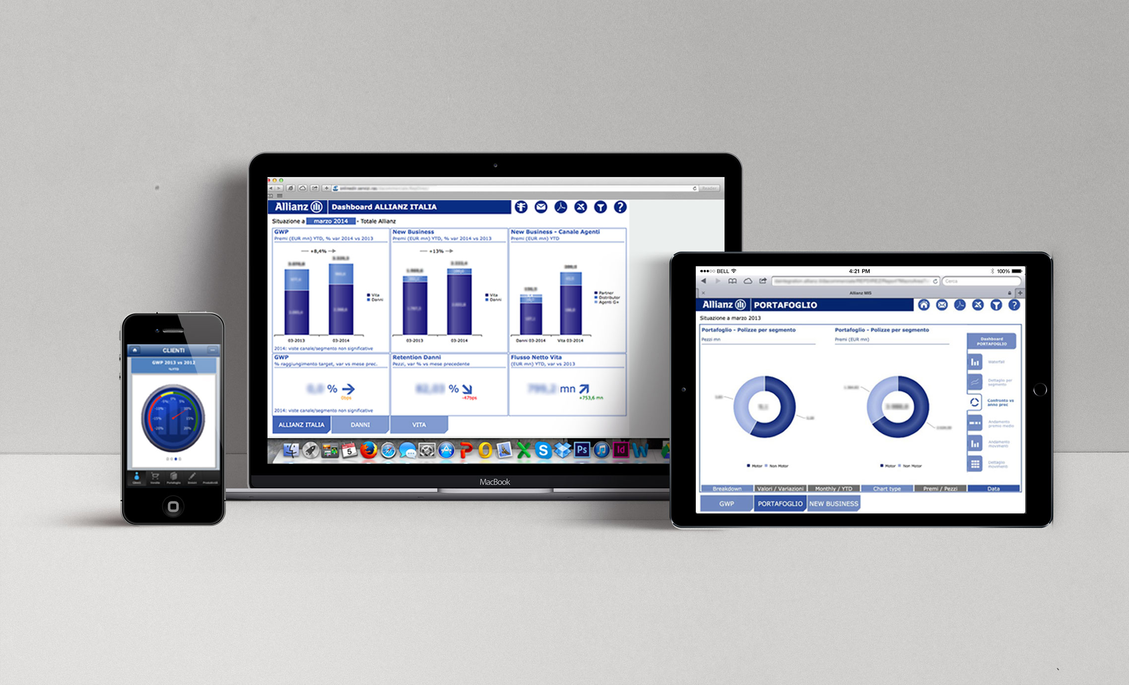
Design of an intuitive interface to help managers keep an eye on the brand's most important KPIs. The project focused on the development of a user interface based on Kendo UI. The project also included the design of the system's architecture, user flows and user testing.
Read on for further details and insights.
Date: 04 March, 2013
Type: UX/UI
Client: Allianz
Design of an intuitive interface to help managers keep an eye on the brand's most important KPIs. The project focused on the development of a user interface based on Kendo UI. The project also included the design of the system's architecture, user flows and user testing.
Read on for further details and insights.
During my first years of experience, I was involved in a yearly digital project for Allianz. The project focused on the development of a user interface based on Kendo UI to help the managers monitor the trend of the business's KPIs. The team included a project manager, two back-end developers, one front-end developer and a UX/UI designer: myself!
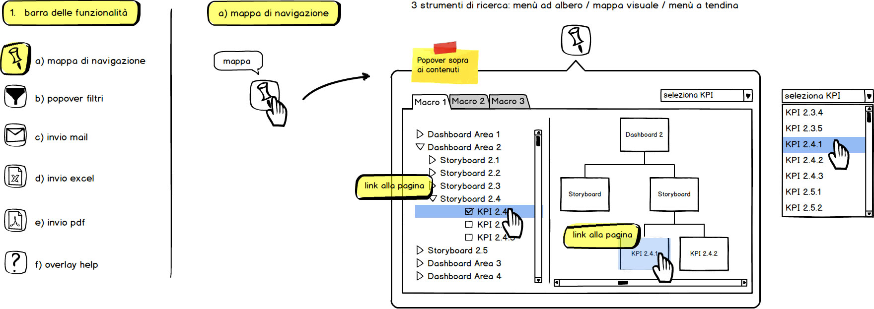
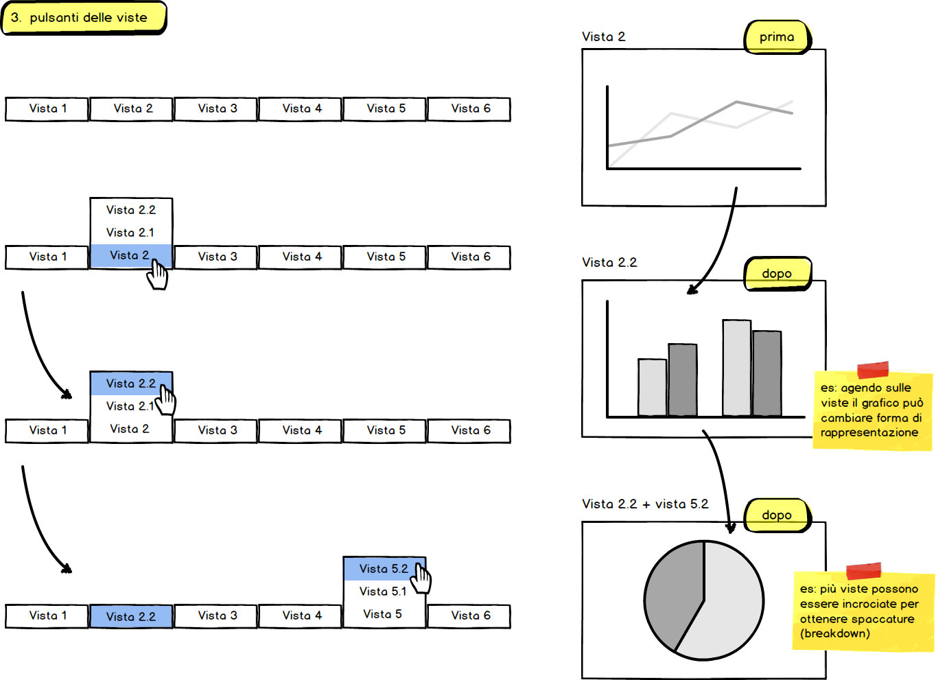
The needs of our users were the following. Each manager had to have access to specific data divided by Allianz's core business units. In every unit, the system had to give the possibility to view the current KPI's trend and to compare it with another period of time (monthly, yearly, etc.). It also had to support a smart navigation within KPIs of the same level, giving the user the possibility to monitor multiple areas at the same time. Furthermore, the application had to have an intuitive navigation, filters and a download option which converted visual data to excel or pdf format.
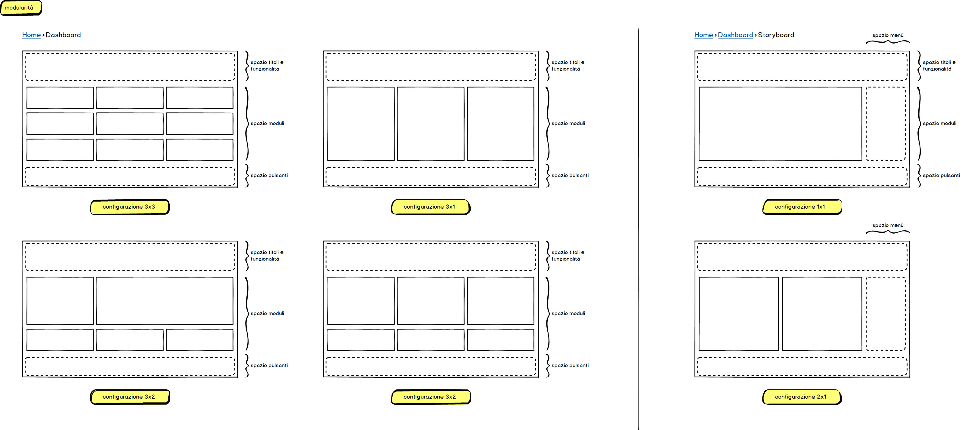
There were a few aspects to consider before developing the first sketches. The majority of our users accessed the system via computer or tablet mainly because of readability issues. This is why the whole interface was designed with a "tablet-first" approach. Our users were top level managers, so the interface had to have a conservative approach and didn't leave much space for experiments. The architecture was fairly complex and had 4 levels of navigation. Furthermore, each diagram generated with Kendo UI could be split up into sub-levels. This meant that the navigation of the interface had a major role in the project and had to be defined prior to everything else.
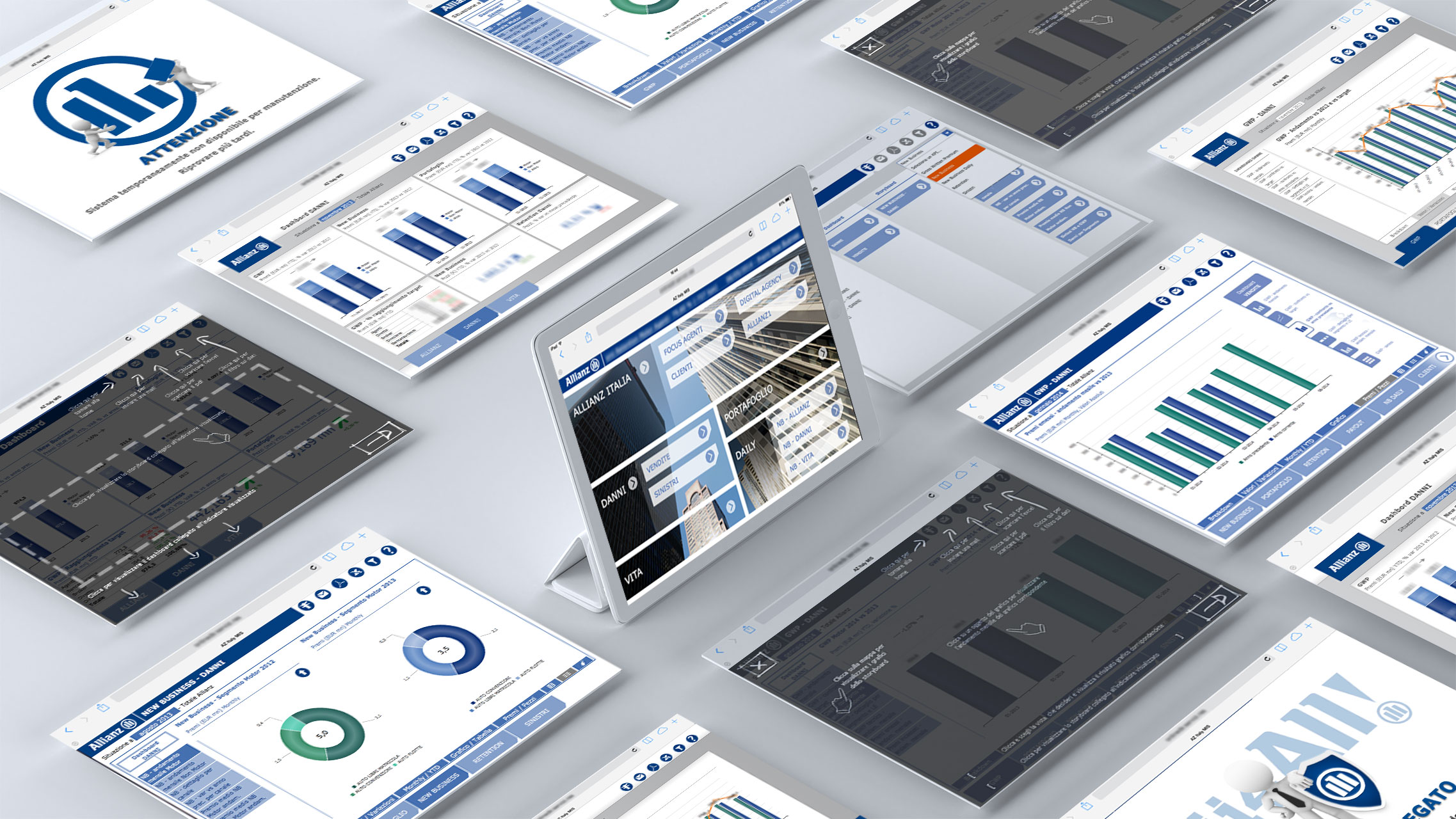
The challenge for me was to "keep it serious with a fresh taste". I had to stick to Allianz's guidelines (color, typography, type of content etc.) but at the same time I had to deliver an aesthetically pleasant interface with something new. This was the typical project in which the functionality has much more importance than aesthetics; but, nevertheless, I had a chance to introduce some pleasing details such as a user friendly help overlay.