Prompt
A large pharmaceutical group supplying hundreds of pharmacies in Italy wants to introduce an incentive program in order to increase sales through a digital platform. The platform can be accessed by the pharmacy’s staff, agents and area managers to monitor product-related KPIs over time and to redeem prices. Data is provided in the form of spreadsheets.
Business Goal: increase sales and brand awareness.
Technical constraints
- Web application
- Predefined brand visual identity
- Predefined end-to-end experience
MVP features
- Monitor product KPIs over time
- Browse and order prices
- Access registry information

Understanding the scenario
Research goals
- Test basic computer knowledge
- Understand how pharmacists use computers in their environment
- Identify existing solutions for data monitoring
Research methods
- Field Studies
- Interviews
- Online research
Environment
Pharmacies generally have one desktop computer with Windows OS (often not updated). They use it for specific tasks such as loading information on drugs, checking expiration dates, loading invoices and packing slips, managing of prescriptions for particular narcotic drugs. All of these tasks are performed on specific software for which training is required.
Agents and area managers are given business phones with no default OS. Some have iPhones while others have Android. They use their phone to deal with suppliers, call pharmacies and check emails. They prefer turning on their laptop when dealing with spreadsheets due to the viewport size.
Users
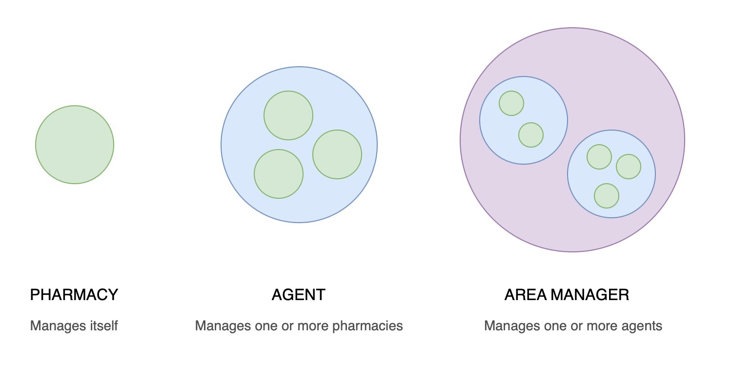
3 levels of management:
- Pharmacist: no management requirements. Monitors performance related to products.
- Agent: manages at least 1 pharmacy. Monitors performance of specific pharmacies and products.
- Area manager: manages at least 1 agent. Monitors performance of specific agents, pharmacies and products.
Existing solutions
Data analytics tools differ depending on the industry, but common data visualisation features can be found among them. The most common way to implement charts on a webpage is with JavaScript and libraries.
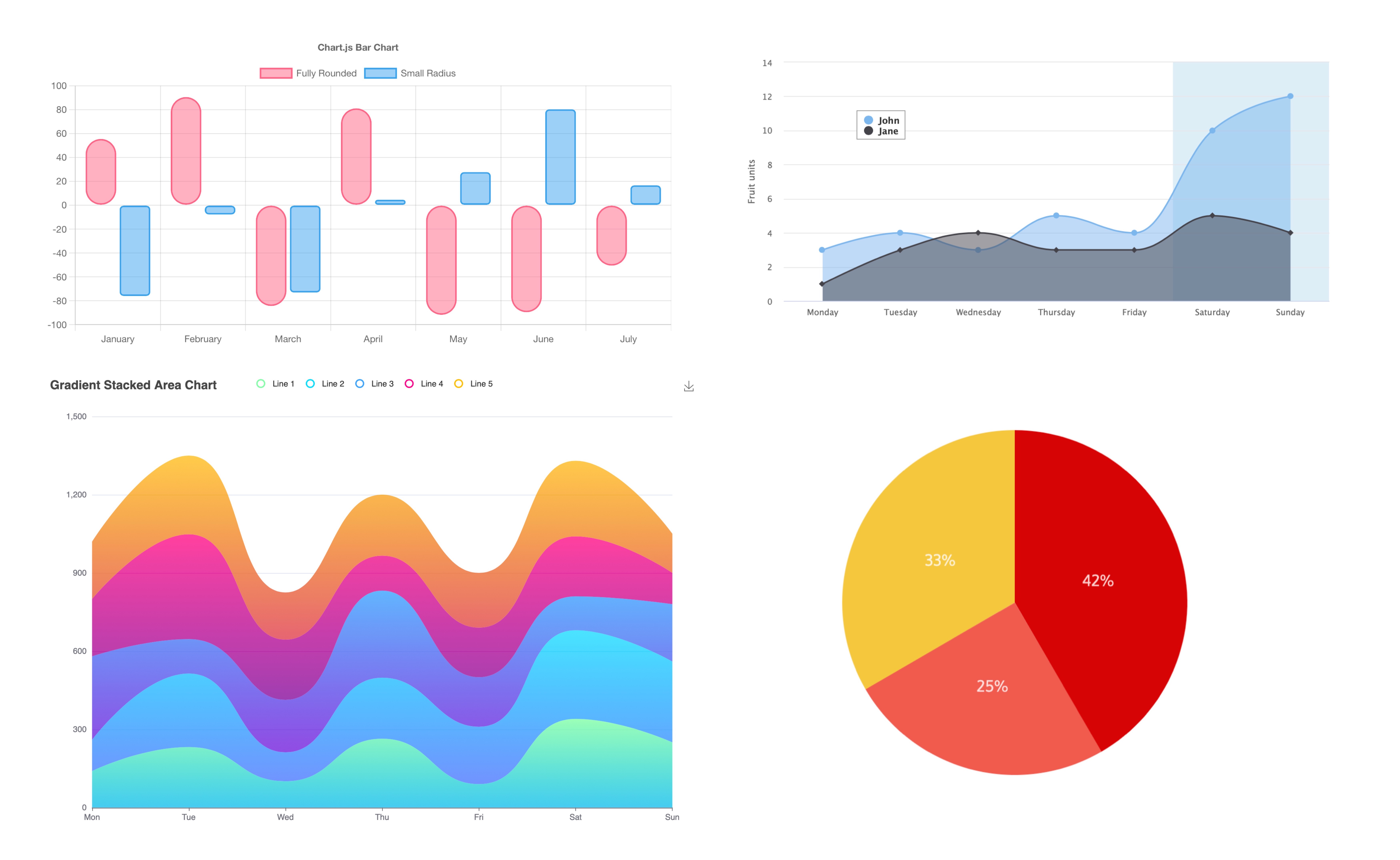
Google Charts offers basic features that could cover our needs:
- Browser compatibility
- No plugins required
- Free forever
- Dynamic data
- Takes data from spreadsheets
RESEARCH INSIGHTS
Limited knowledge
Pharmacists have limited knowledge on how to use spreadsheets. The platform must have easy filters to fetch data.
One device for multiple users
Pharmacists use a single device, agents and area managers have their own. The platform must accommodate multiple user needs.
One image is worth a hundred words
Charts can instantly communicate how a metric is performing in a more digestible format than spreadsheets.
Framing the problem
Observing how users interact with business software brings up a series of considerations related to the effectiveness of a spreadsheet view. Spreadsheets seldom appear in a normal business day in a pharmacy. We therefore expect staff to have trouble dealing with native filters when finding data. There might be an issue with the Client's initial assumption:
"Upload these spreadsheets on a platform, our staff will use filters to find the desired data."
To prove our point, let's run a small test on one of the Client's spreadsheets. We are going to simulate a series of ordinary tasks we expect pharmacists to perform, such as applying filters to multiple fields (pharmacy, brand, product).
Only pharmacy staff is recruited for this test, as we don't have the possibility to recruit Agents and Area Managers. Pharmacists are therefore going to be asked to perform the latters' tasks along with their own.
USABILITY TEST
>3min
Time on Task
2/3
Seeking help
57
SUS score
“There are too many filters in this sheet.”
Users eventually have trouble performing the tasks they are given. We can now use this data to confute the Client's beliefs:
"What’s the point of developing a platform? Spreadsheets can be sent by email. Users have trouble filtering hundreds of rows."
Problem statement
Searching for data in spreadsheets can be time-consuming and complicated for people who have very basic knowledge when it comes to using computers. The hectic environment in which pharmacists find themselves operating is not ideal for filtering hundreds of rows of data. Information has to be visible at a glance in order to identify potential areas of improvement and reach the Business's primary goal: to sell their products. In addition to this, the Business isn't planning any training to use the platform. Users must thereform be able to perform tasks autonomously when using the platform.
Defining the Solution
First iterations
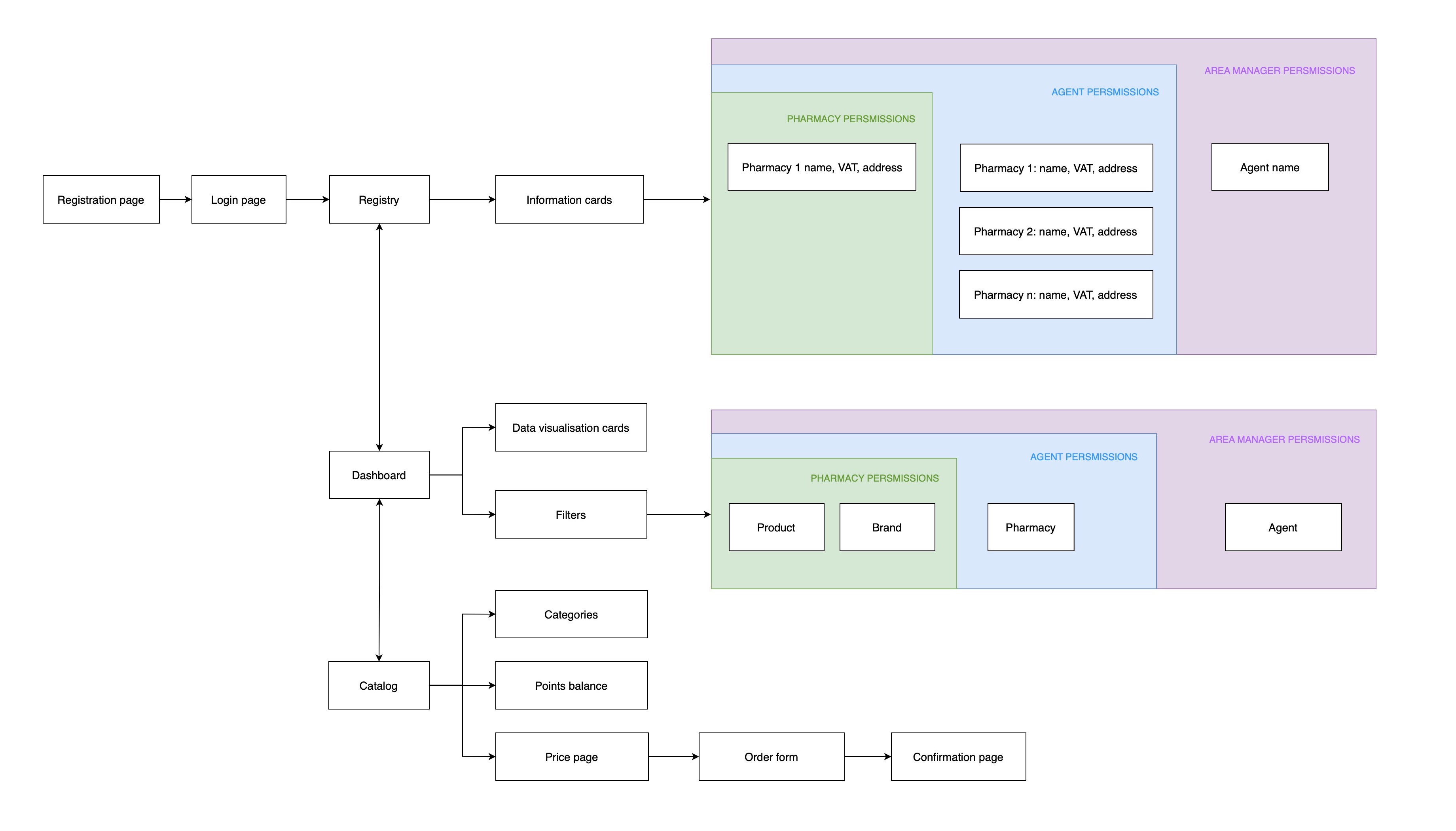
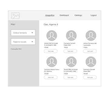
Before diving into wireframing, let's map the information architecture of the platform taking into account all levels of permissions.
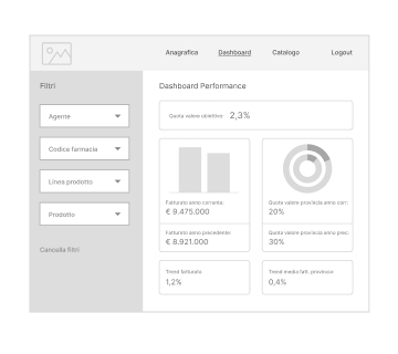
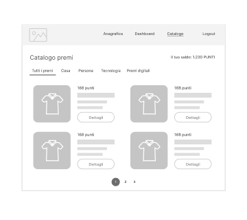
A first set of mid-fidelity wireframes is then designed to discuss the solution with stakeholders in terms of compliancy and feasibility. This involves touch-points with the front-end developer, the project manager and the Client itself who seems to appreciate our idea.

Validation
Let's now test the efficiency of our solution. A second test is planned with the same users and the same tasks performed in the discovery phase to validate our design decisions. We are going to test our both desktop and mobile versions of our mid-fidelity mockups as they already contain plausible data.
Goal: validate design solution and improve user satisfaction
USABILITY TEST
13s
Time on Task
0/3
Seeking help
82
SUS score
“I think I can learn how to use this tool.”
Users seem to appreciate our revised solution to using spreadsheets. Benefits are proved by a reduced time on task, no need for assistance and an overall positive user satisfaction feedback.
The test also highlights potential opportunities to reduce friction in the flow and improve the interface:
Insights
- Users are not sure why they have to view the Registry page first
- The meaning of “Dashboard” isn’t immediate
- There is no way to track orders on the platform
Opportunities
- Give users a way out of the Registry page (CTA)
- Replace word “Dashboard” with something more meaningful to users
- Discuss implementation of a tracking system with both Client and Team
Design Solution
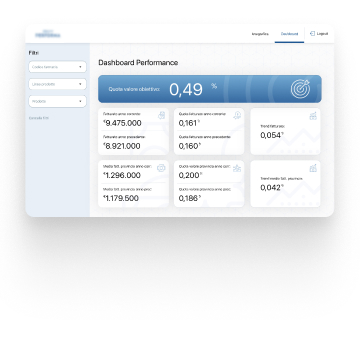
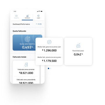
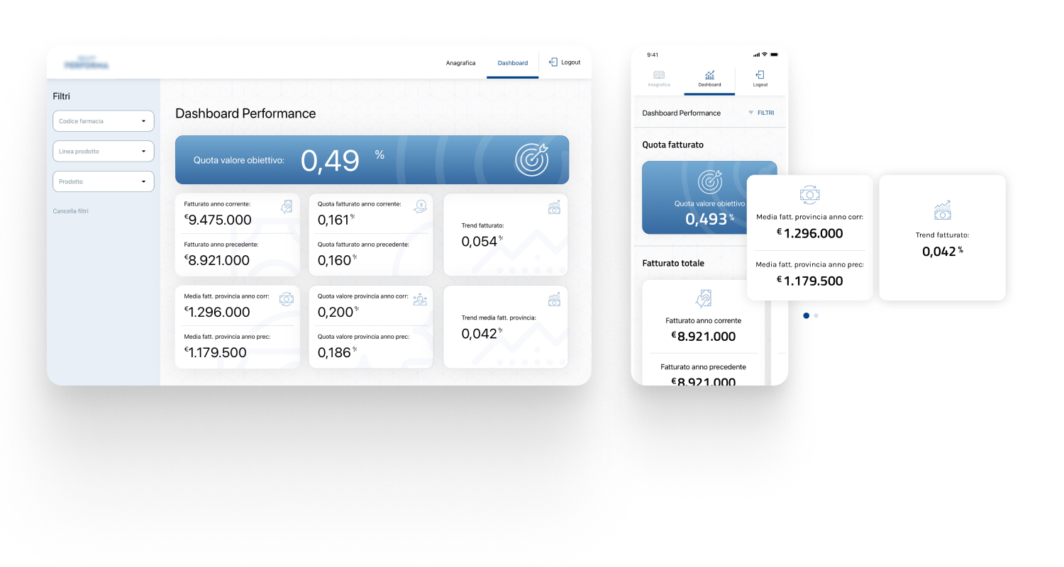
The solution focuses on ease of use and information hierarchy to highlight important information. The palette displays tints and shades of the brand's primary color. A specific icon set related to finance is designed for the platform.
Important information at a glance
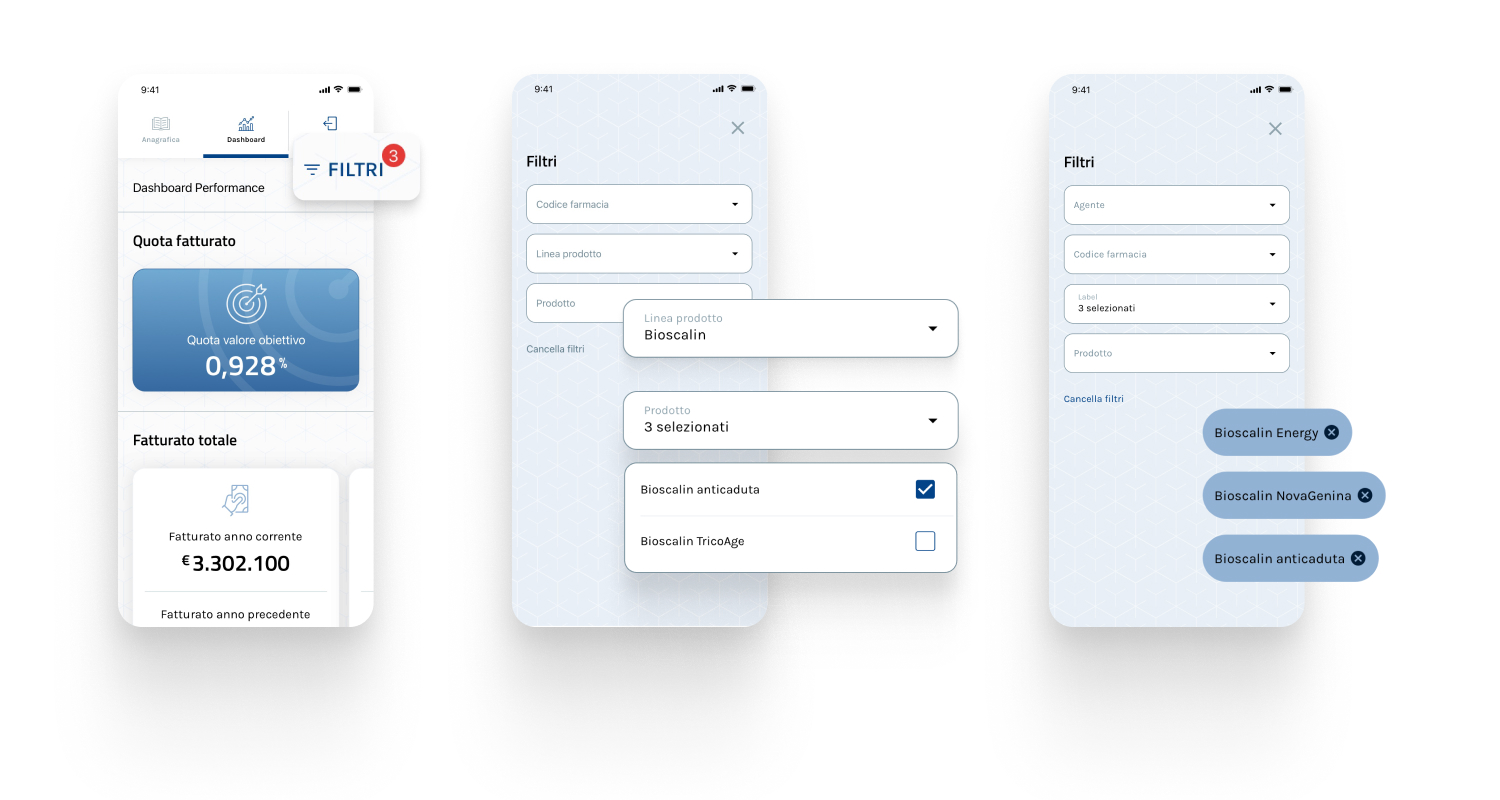
All KPIs are visually grouped in the same view and the most valuable one is highlited in blue. On mobile devices, horizontal scrolling is used to save space.
Easy filtering
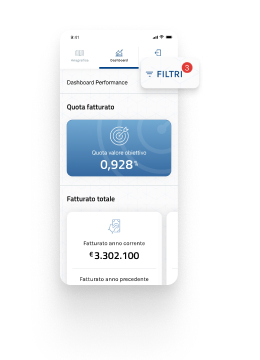
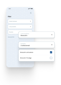
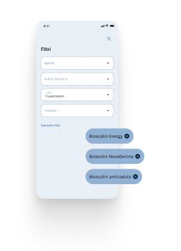
Filtering is made easy by separating fields in independent dropdowns. When the system is displaying filtered data, users see a red badge in the dashboard view. Filters can be edited with the help of chips.
Seamless ordering experience
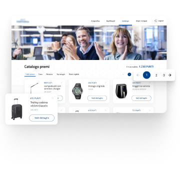
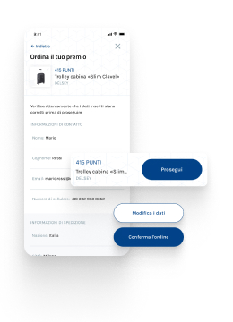
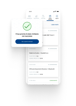
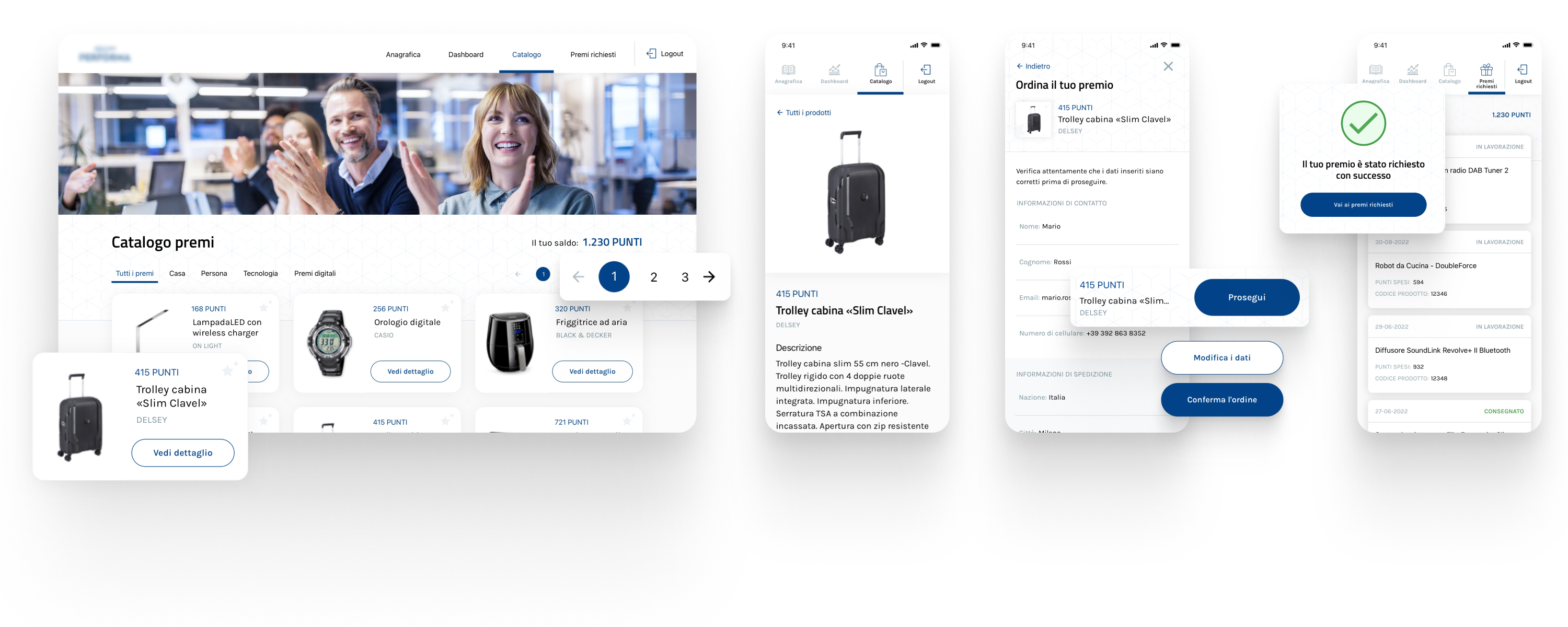
Prizes are grouped by category for users to easily browse the catalog. Items can be ordered by filling in a form with the pharmacy's information. Order status can be easily monitored in a dedicated section.
Results
Benefits for Users
Users were relieved to no longer have to find their way through complicated spreadsheets. This resulted in a higher user satisfaction and a reduced average time on task.
Benefits for the Business
The Business can reduce expenses because pharmacy staff will never require specific training (the platform is very easy to use).
Learnings
Challenges faced
- Time constraints made it impossible to implement visual charts in the solution. We ultimately had to opt for a numerical representation of data.
- We couldn’t implement a color coding system to display KPI performances based on a specific baseline due tu limited resources. This could have been very helpful for users when identifying areas of improvements.
- We had no evidence until the end of a feature enabling users to track the delivery status of their prices, so we had to find a takeaway by inserting an additional item in the menu.
What I learned
The first solution is never the real solution
The project started out with fixed criteria and predefined solutions. We could have easily uploaded the spreadsheets inside the platform if we hadn’t thought about the capabilities and limitations of our target users. Interacting with real people has spotted severe problems at the beginning and we had time to come up with a more efficient solution.
Time constraints matter
The timing for this project was not much because the team's effort was initially limited to the UI phase. The discovery phase highlighted issues with the original solution, but the resources had already been allocated accordingly. It was impossible for the team to condense all the phases of the process in so little time. The ultimate solution was not perfect, but better than the initial input given the tight deadline.